Mind the Bridge / Platform redesign / 2023
A better way to connect innovation.
Rebuilding the experience that connects investors with startups. From fragmented navigation to a coherent platform and a shared design system.
User retention
Investor sign-ups
Post-launch measurement
My contribution
Project lead · I mapped the information architecture, created wireframes, and built the shared design system.
Collaboration
Mind the Bridge’s product team and GlueGlue’s Product Design Manager.
Timeline
Jul 2023 - Oct 2023
01 / The challenge
Three audiences. One fragmented experience.
Mind the Bridge helps investors create technology challenges and connects them with startups that can offer solutions. The platform needed to serve investors, startups, and institutions, each with different needs.
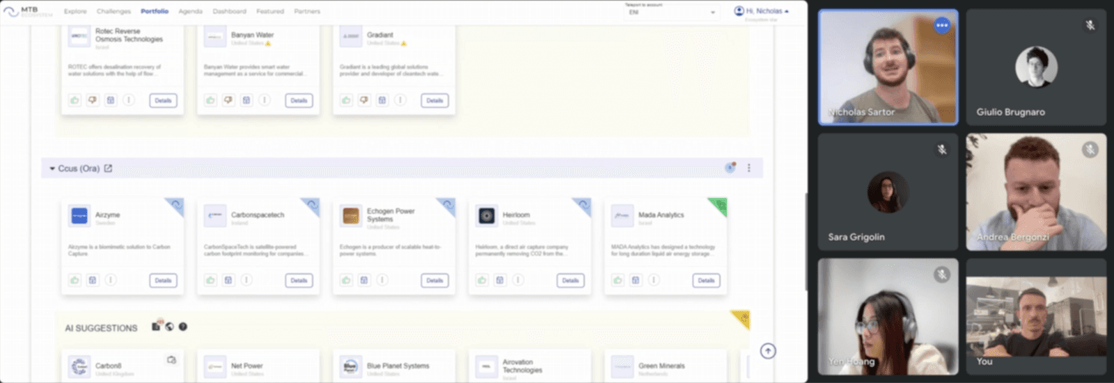
A mix of React libraries had left the interface inconsistent. Pages were scattered, navigation varied across the product, and creating a startup challenge was difficult to understand.
02 / Key decisions
Agree on navigation before building the UI.
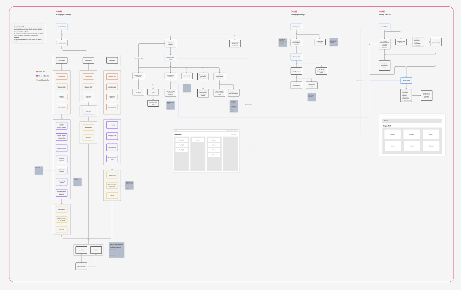
I started by mapping the platform’s features and designing an information architecture around its three user types. The goal was to give each audience a clear path through the product.
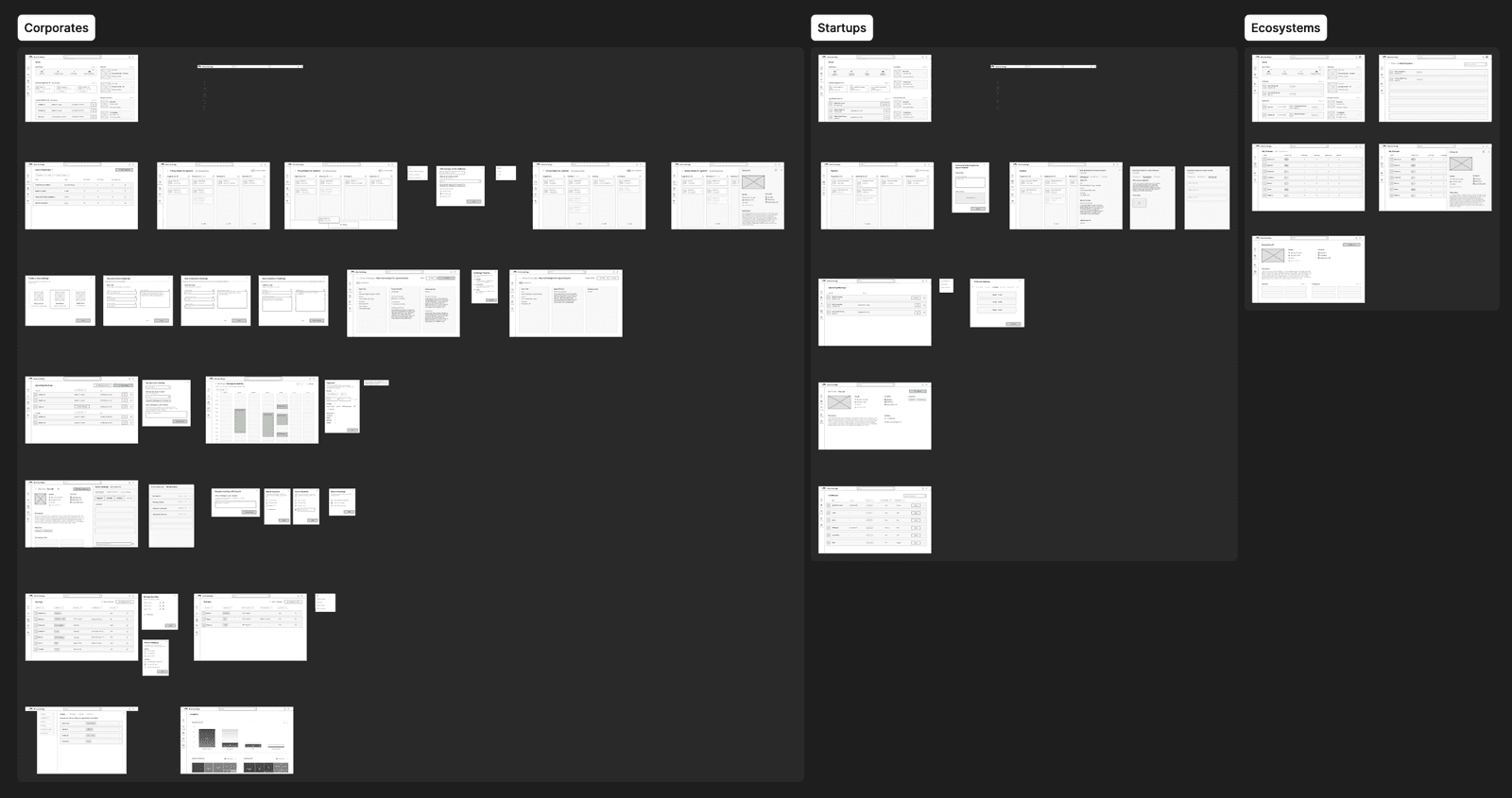
Without direct competitors, we studied adjacent deal-management tools such as Pipedrive. A Kanban view could make progress visible, while table and list views remained valuable when users needed to manage larger volumes. Wireframes helped us align with stakeholders before committing to the interface.
03 / The solution
Build every page from a shared system.
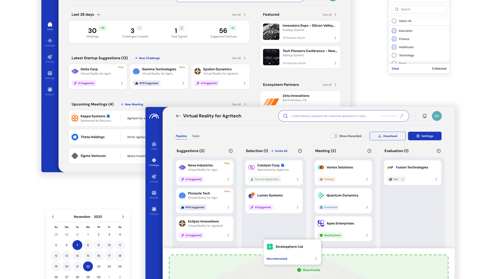
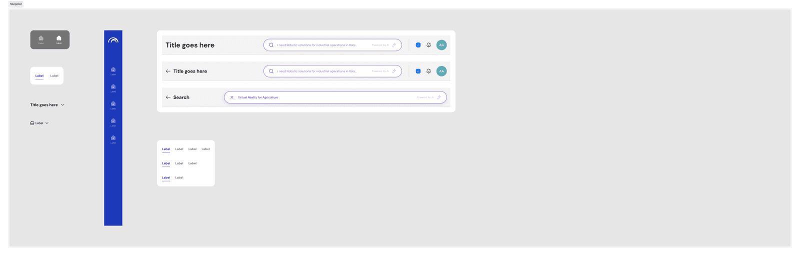
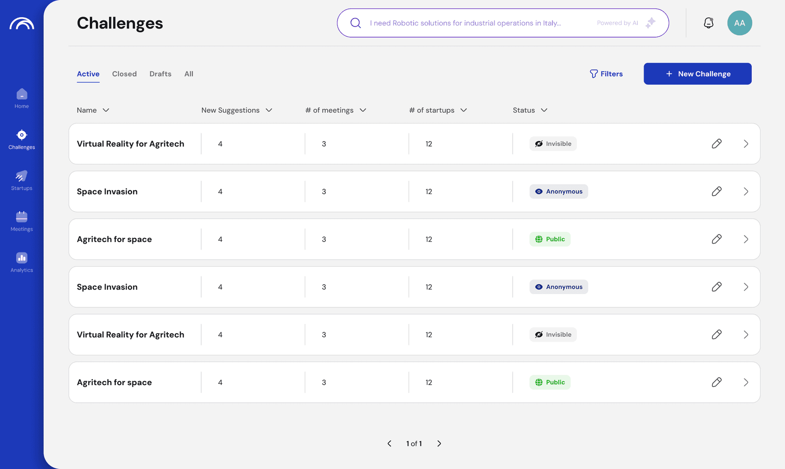
Once we aligned on the experience, I developed a focused design system. Shared components gave us a consistent way to build every page, while making the high-fidelity design work more efficient.
The system supported a refreshed experience across discovery, challenges, and relationship management. It connected the individual screens into a product that felt coherent.
04 / Outcome & learning
Retention rose 53% in the first three months.
In the first three months, the redesign was followed by a 53% increase in user retention and a 15% increase in investor sign-ups.
Mapping the three audiences before committing to screens gave the product team a shared basis for reviewing the navigation. Reusing components then carried those decisions into the high-fidelity pages. The lesson was to resolve the platform’s structure first; visual consistency depended on that foundation.