Brevo / Scheduling experience / 2024
Making every send feel effortless.
A clearer scheduling experience for more than 200,000 campaigns a day. Connecting customer needs, product strategy, and a more useful upgrade path.
Rage clicks
User retention
Annual recurring revenue
My contribution
Project lead · I combined research and support-ticket analysis, redesigned scheduling, and delivered the SMS MVP.
Collaboration
Product designer, UX writer, product manager, and engineering.
Timeline
May 2024 - Jun 2024
01 / The challenge
A critical moment. Too much uncertainty.
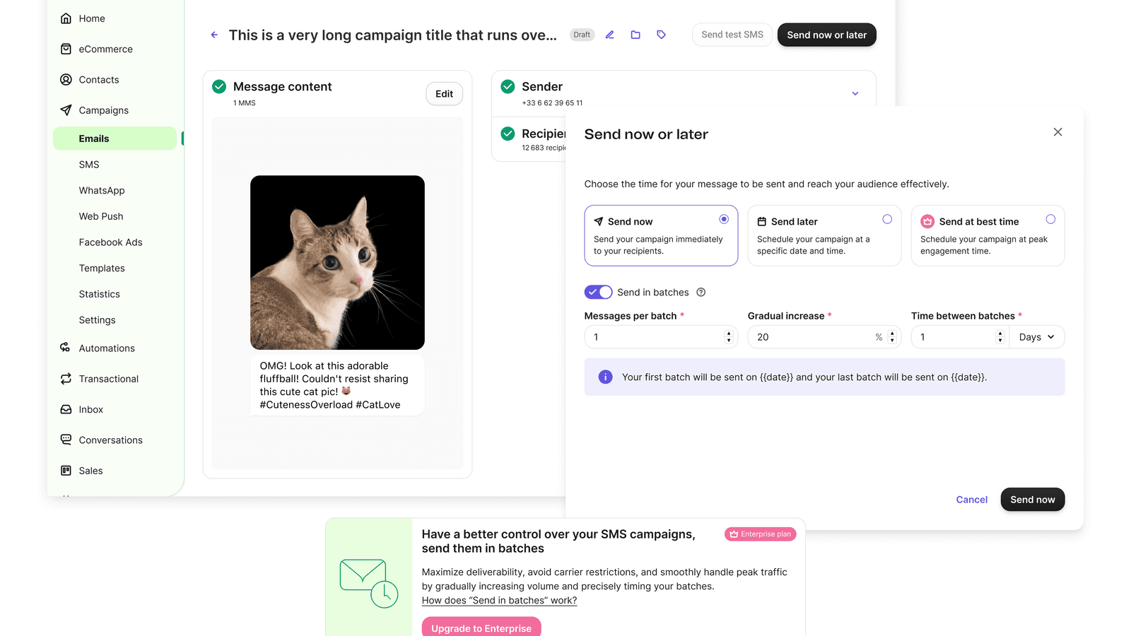
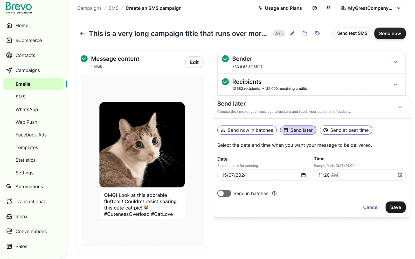
Brevo’s customers schedule more than 200,000 campaigns daily across email, SMS, and WhatsApp. Research and support tickets showed that people struggled to understand when a campaign would send, change its schedule, and recover from errors.
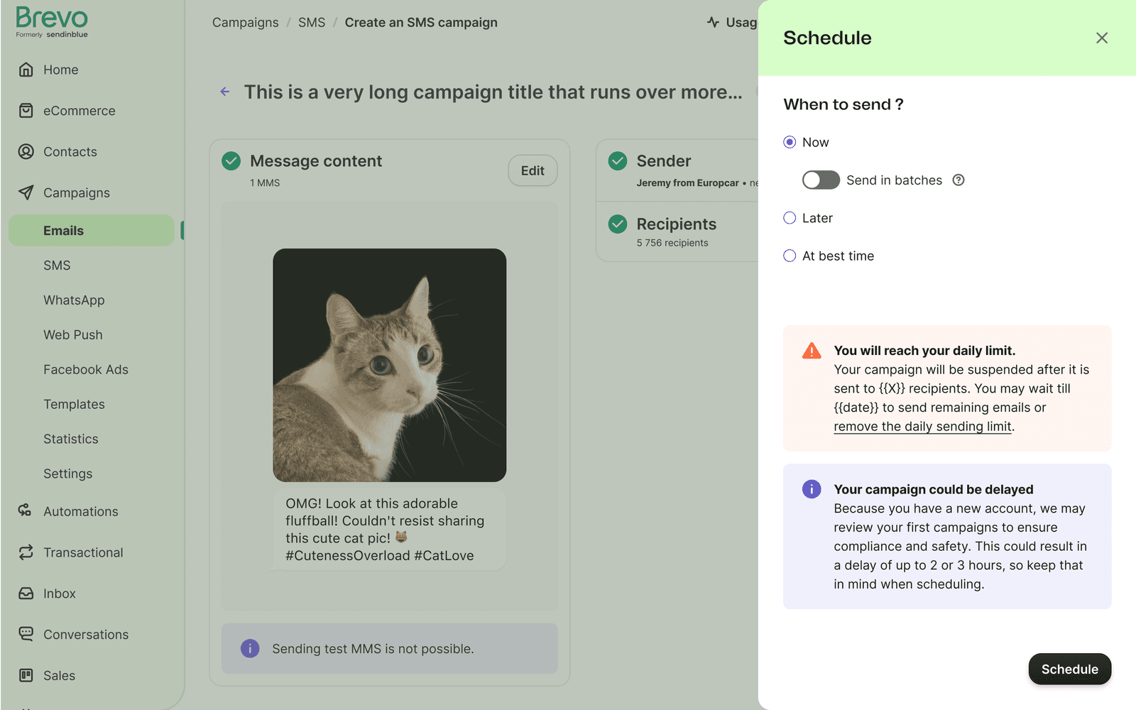
The existing layout crowded alerts into a small space, hid important settings behind scrolling, and gave little context for paid features. Only 0.11% of users used “Send in batches”—a signal that discoverability and value needed attention.
02 / Key decisions
Testing favored a dedicated scheduling modal.
I combined ongoing UX research with an AI-assisted analysis of Zendesk tickets. That evidence helped the team focus on uncertainty around send times, difficulty editing campaigns, and technical friction.
We explored scheduling within the campaign page, a tabbed approach, and time-selection chips. Early user tests confirmed that the inline layouts were confusing. A dedicated modal gave the decision a clearer focus.
03 / The solution
Make sending options and later edits explicit.
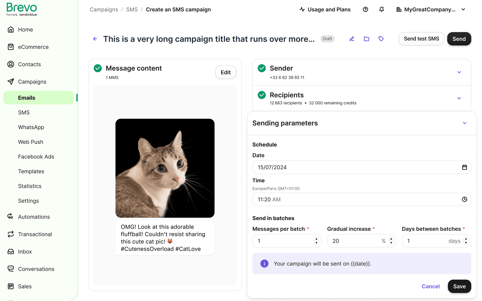
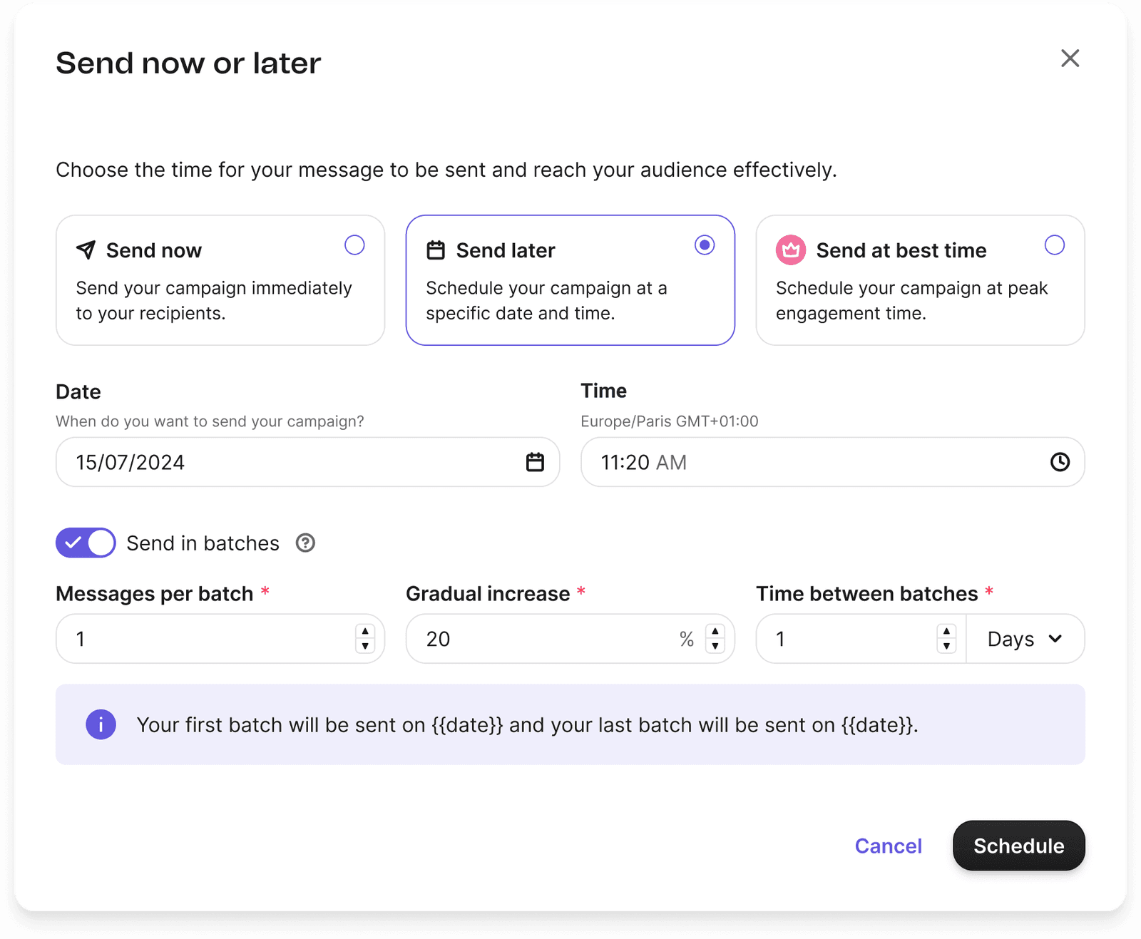
We removed large decorative images, added descriptions to the sending options, and used horizontal input layouts to keep even the longest configuration visible without scrolling.
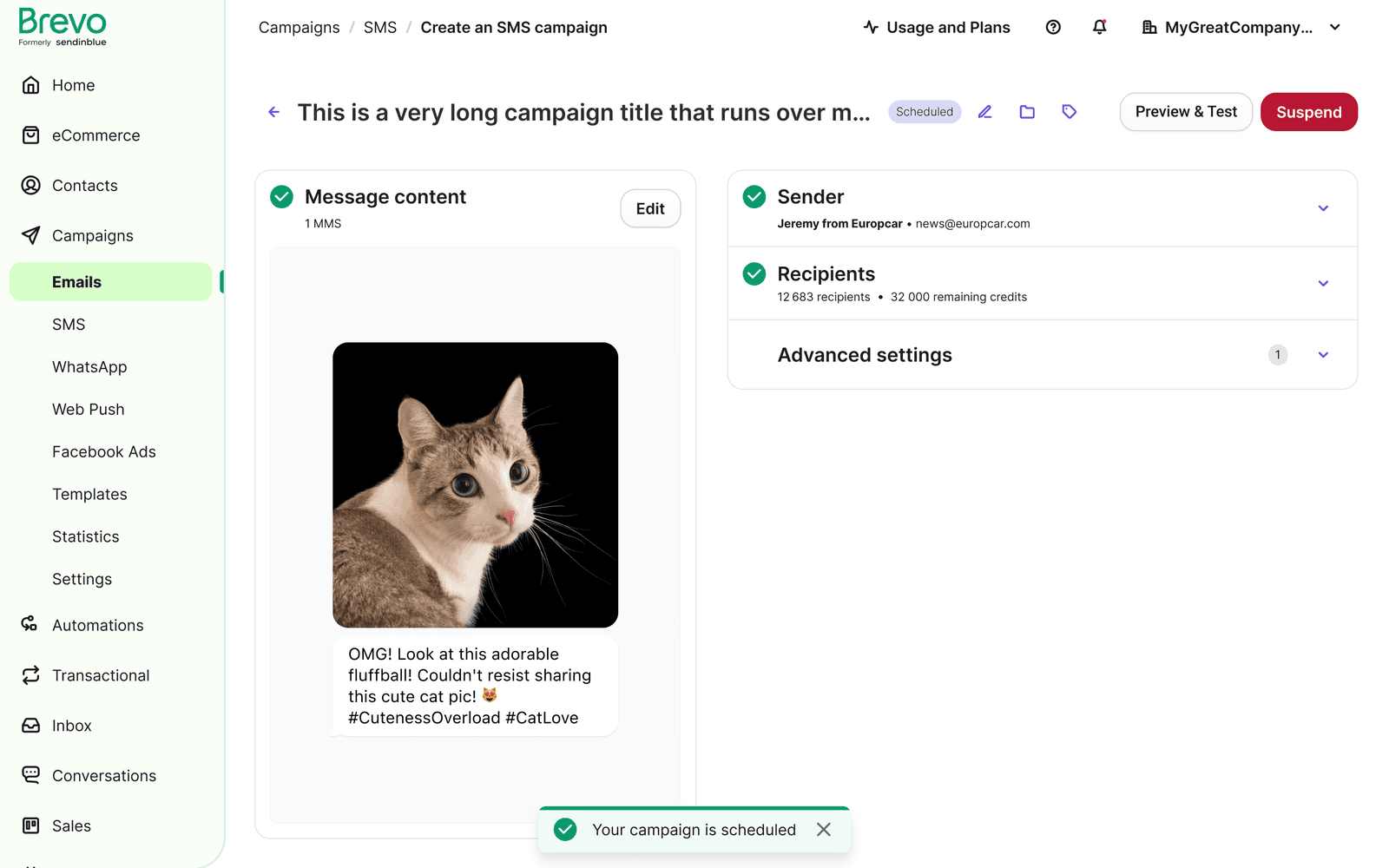
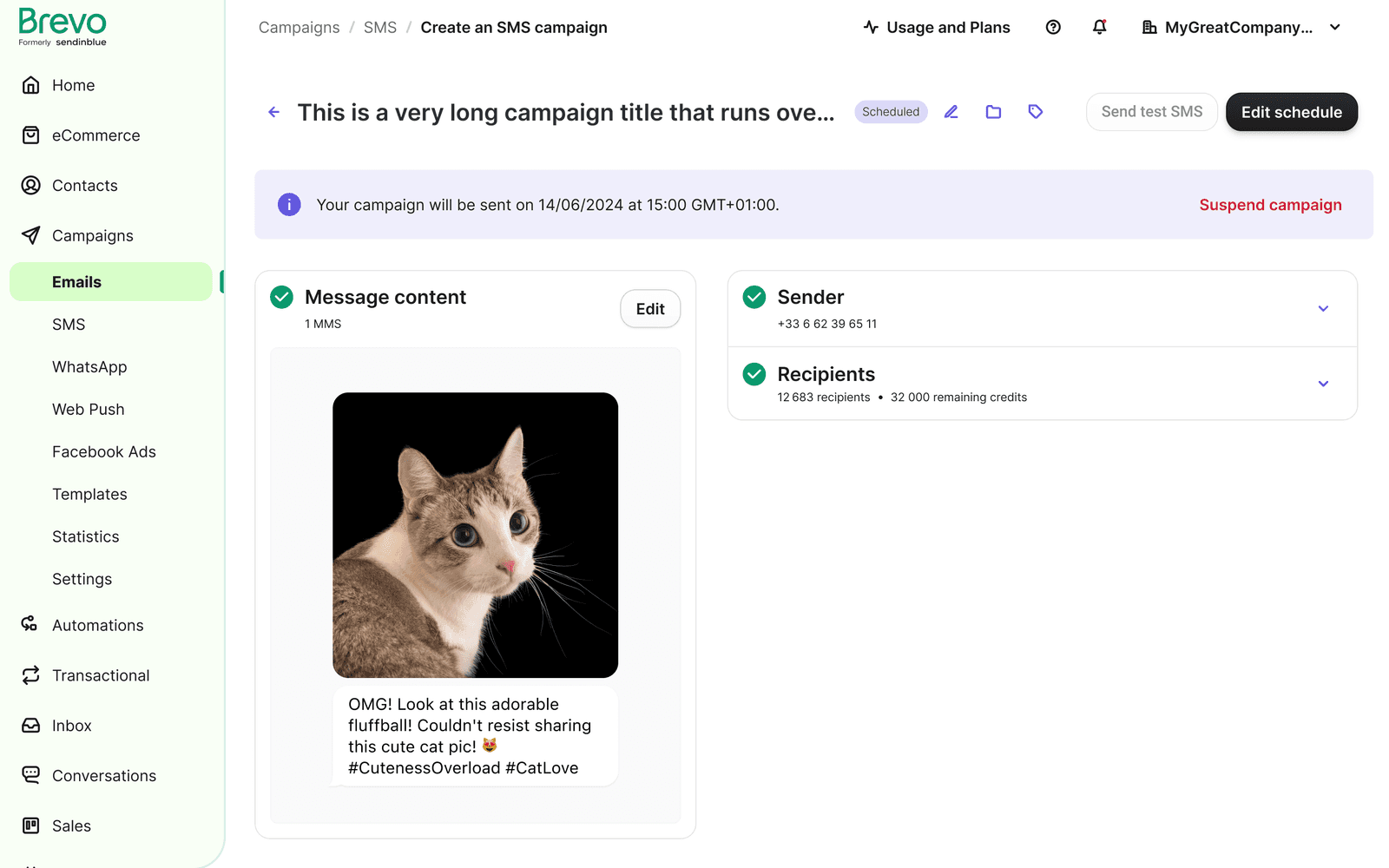
The “Send at Best Time” card explained its benefits even when unselected. “Send in batches” became a premium feature with clearer upgrade guidance. After scheduling, an information card confirmed the date and time, and “Schedule” became “Edit Schedule.”
04 / Outcome & learning
An SMS MVP with measurable improvements.
We released the modal for SMS campaigns first. After implementation, rage clicks fell 37%, user retention rose 24%, and the upgrade-card changes contributed to a 3% increase in annual recurring revenue.
The rollout started with one channel so the pattern could be validated before extending it. Support evidence and the 0.11% usage of batch sending helped me connect the usability work to a specific product decision: improve the clarity of both the sending options and their paid value.