Airfinity / Dashboard & data visualization / 2022–2023
Less friction. More insight.
Turning an inconsistent set of embedded charts into a flexible, coherent experience. Keeping complex data useful without hiding the controls people rely on.
User retention
Average session duration
Customization adoption
My contribution
Project lead · I conducted customer research and iterated the chart controls and data-visualization experience.
Collaboration
Product manager and engineering.
Timeline
Nov 2022 - Jan 2023
01 / The challenge
The data was there. The experience was disconnected.
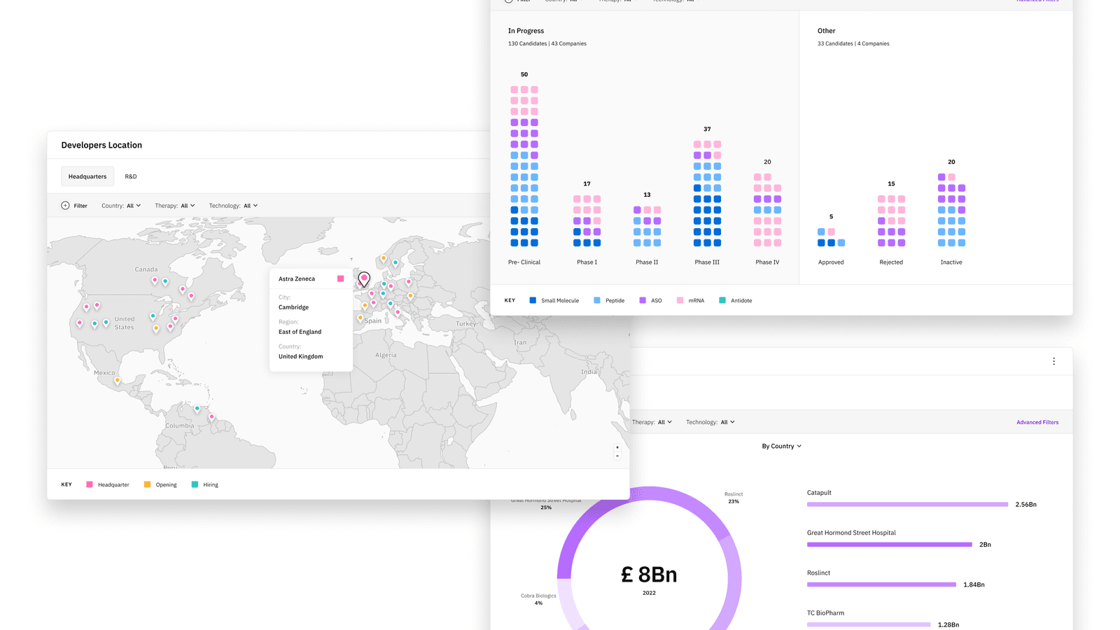
Airfinity’s platform mirrored charts from external services such as Tableau. That created an inconsistent experience and limited the ways customers could customize their charts.
We interviewed customers about their biggest frustrations, the capabilities they expected, and what might stop them from using the product. Their answers made clear that different audiences needed different views of the same data.
02 / Key decisions
Test visible controls against space for the chart.
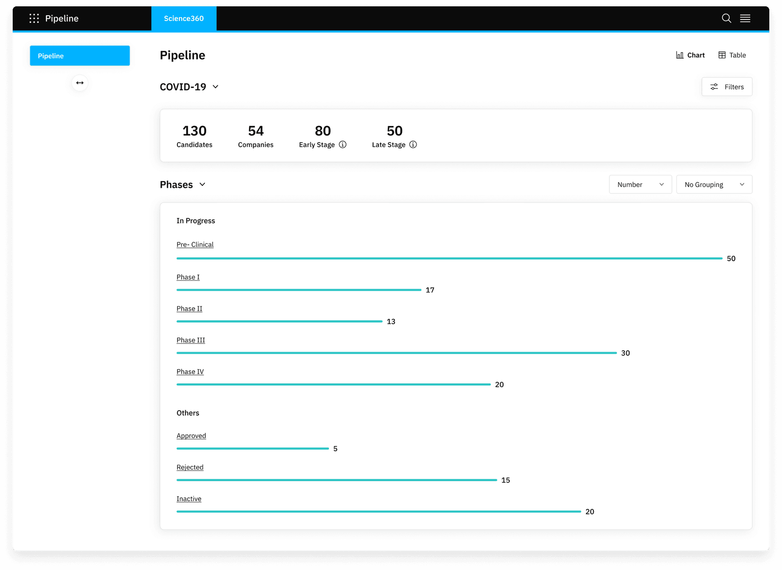
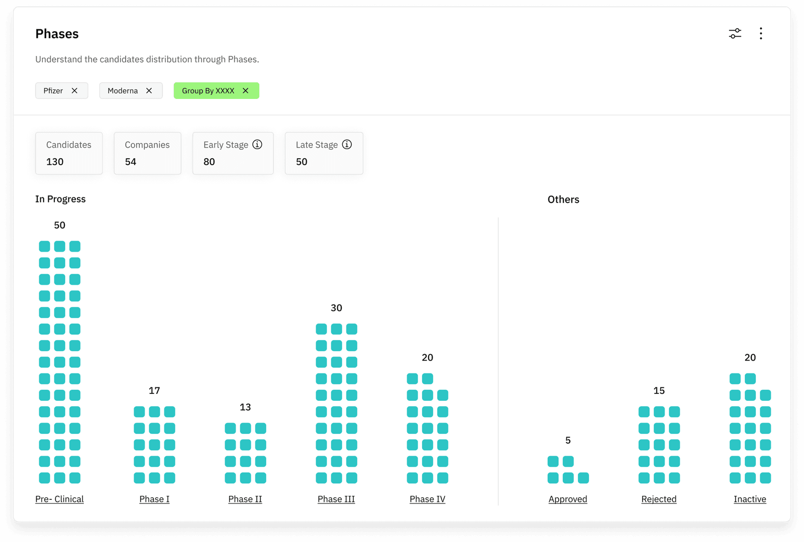
The work had two connected parts: improve the chart container and controls, then determine the right way to represent the data. Moving options inside the card helped their connection to the chart, but created a scaling problem as the number of options grew.
We explored controls outside the card, below the title, and behind buttons. Each direction introduced a tradeoff between discoverability, white space, and room for the graph. Feedback repeatedly sent us back to refine the approach.
03 / The solution
Expose essentials and keep advanced controls available.
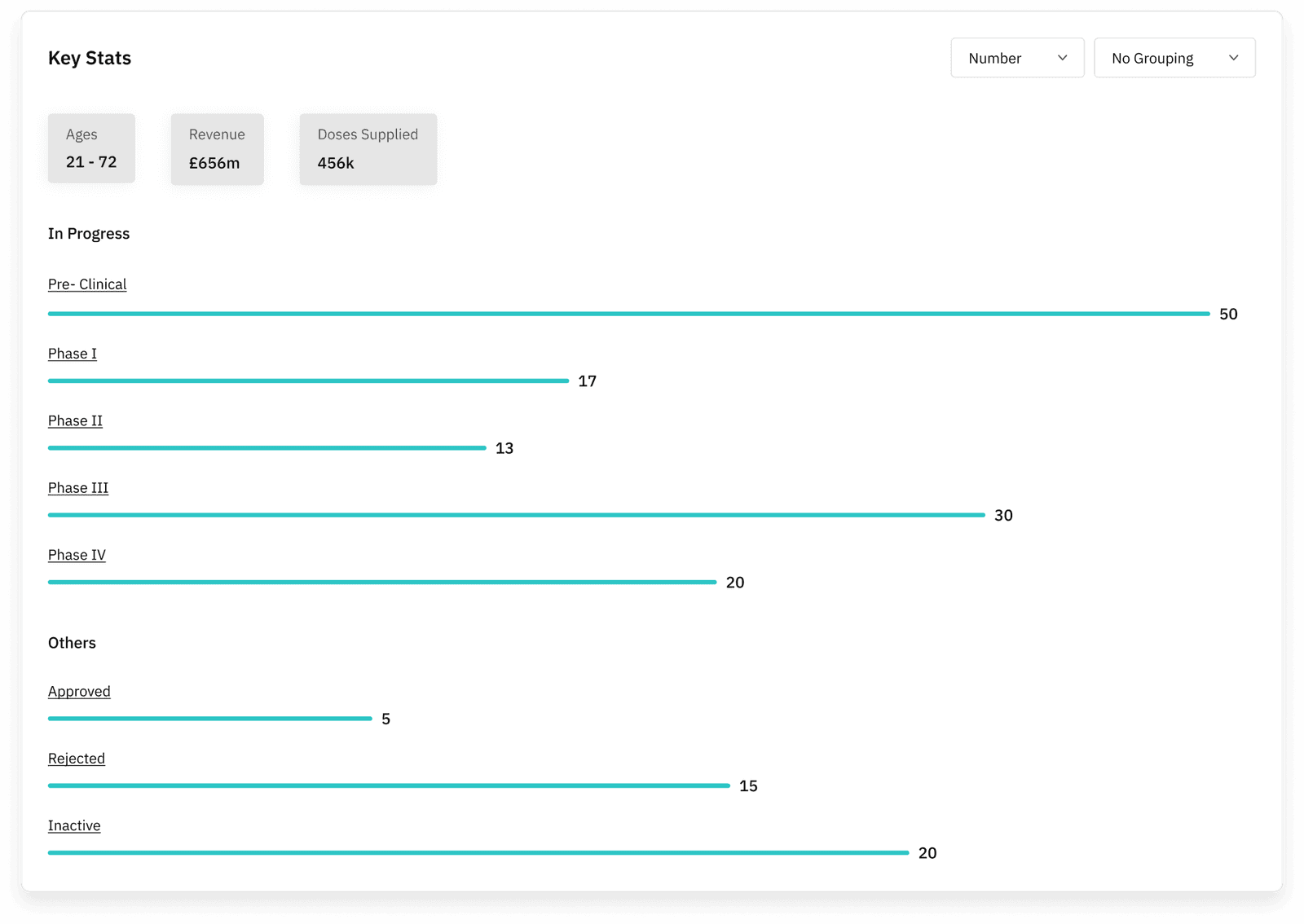
A polished version with controls behind buttons looked cleaner, but some users preferred to see the parameters they could change at a glance.
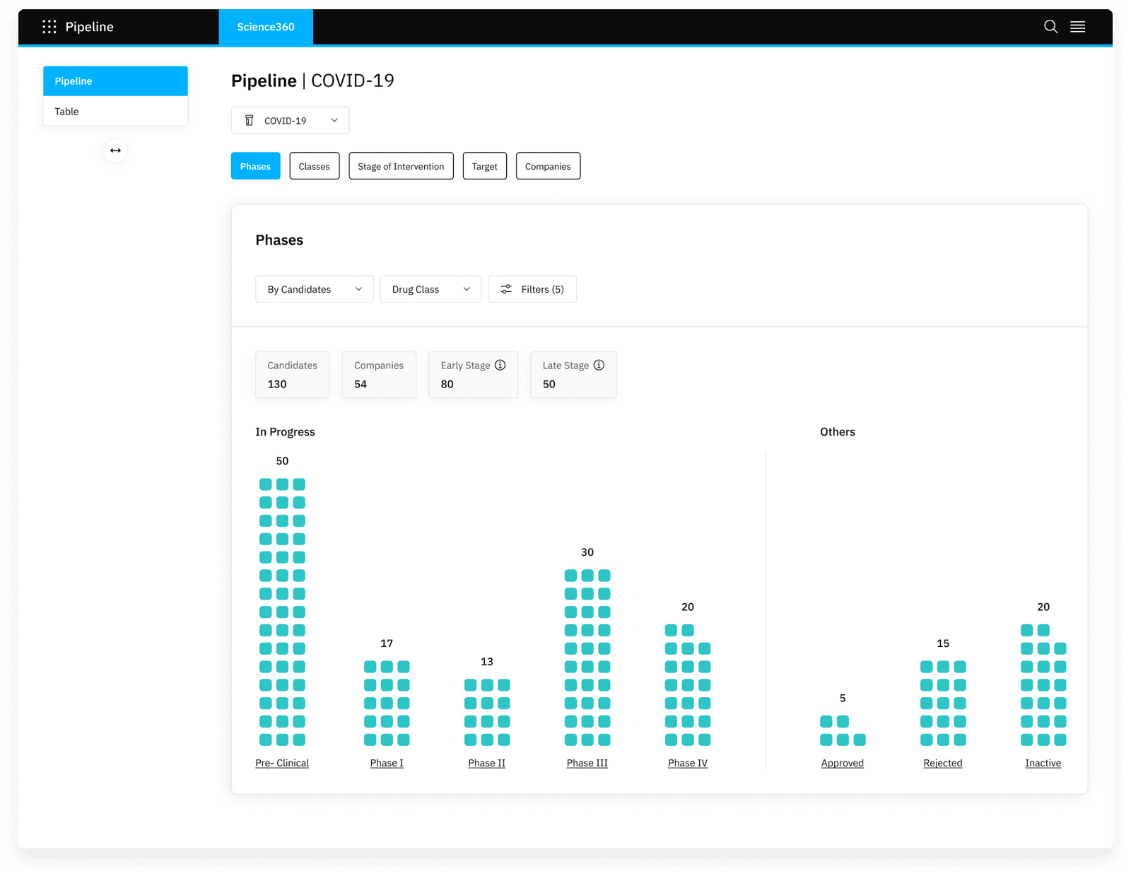
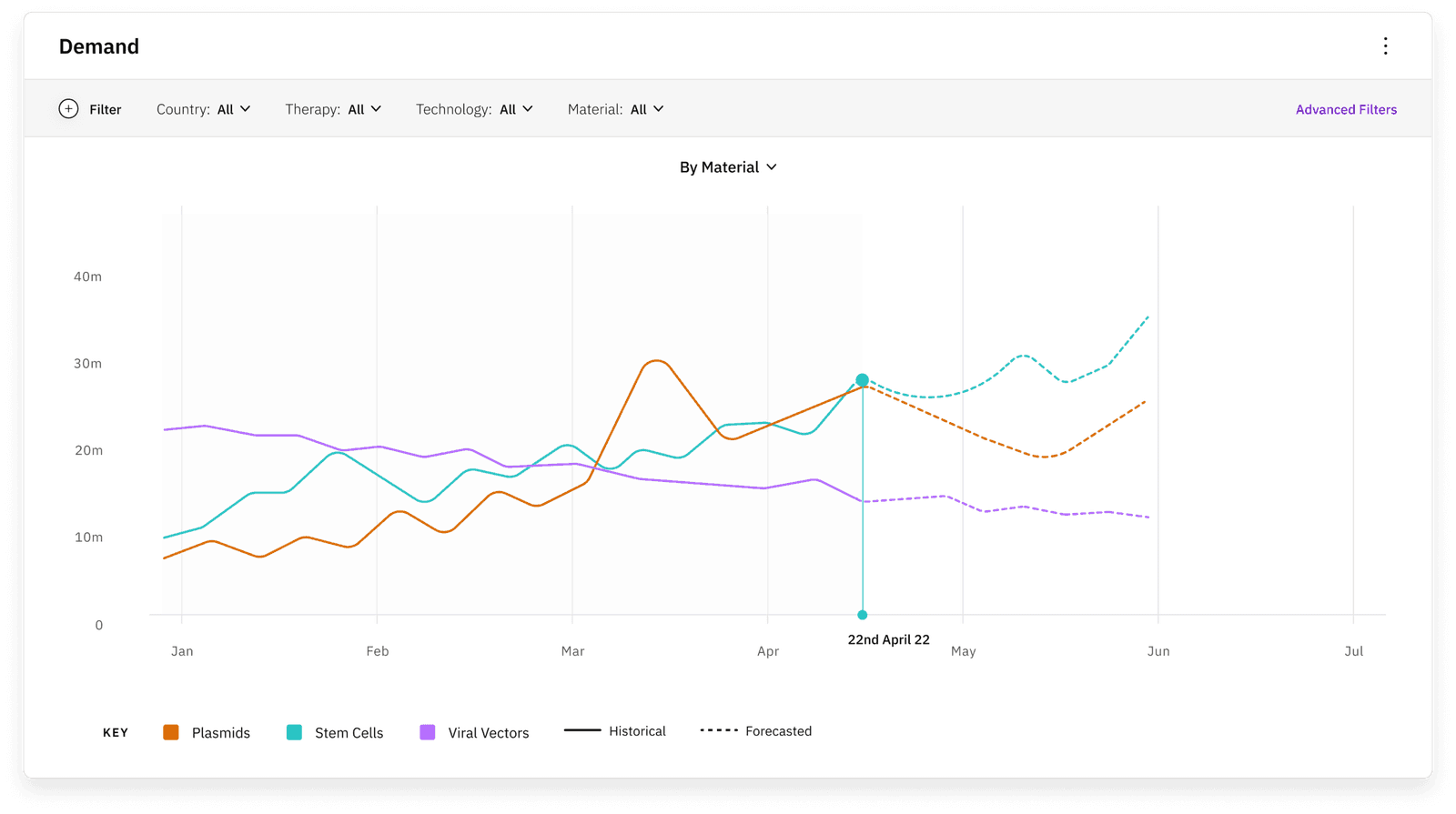
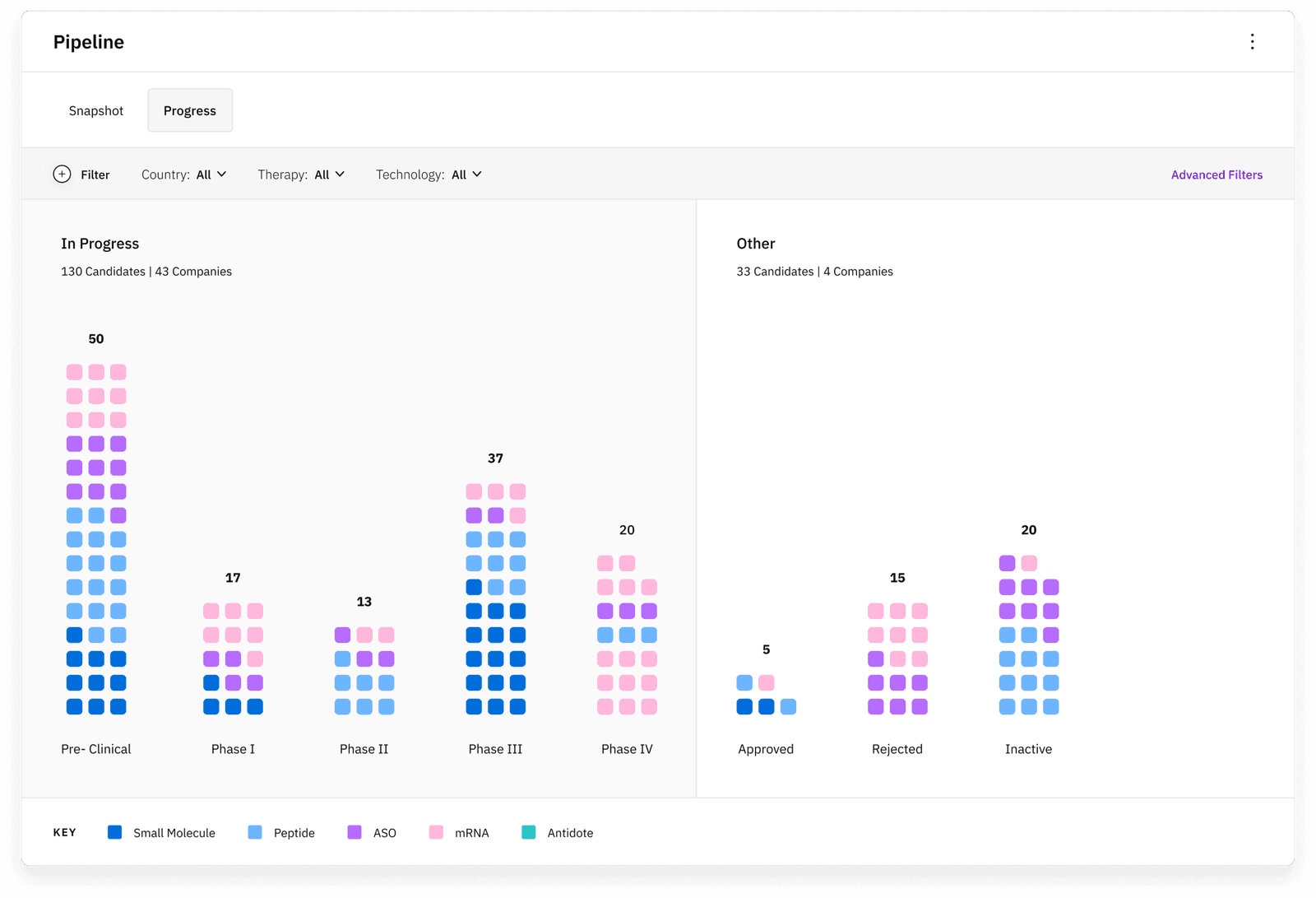
The final direction combined visible controls with additional options behind a button. Several feedback sessions helped us find the right configuration. The result was a complete, consistent chart experience without relying on external embeds.
04 / Outcome & learning
Half of users adopted chart customization.
After implementation, retention increased by 40% and average session duration by 30%. Half of users adopted the customization features, while post-launch surveys reported a 25% increase in satisfaction ratings.
A cleaner interface was insufficient when it hid parameters people needed to inspect. Feedback led us back to a hybrid layout: enough control visible to understand the chart, with further options available on demand. That trade-off became the basis of the final system.