Duration
Jul 2022 - Sep 2023
My role
Problem Analysis: Conducted a detailed assessment of existing filter usability, identifying multiple friction points.
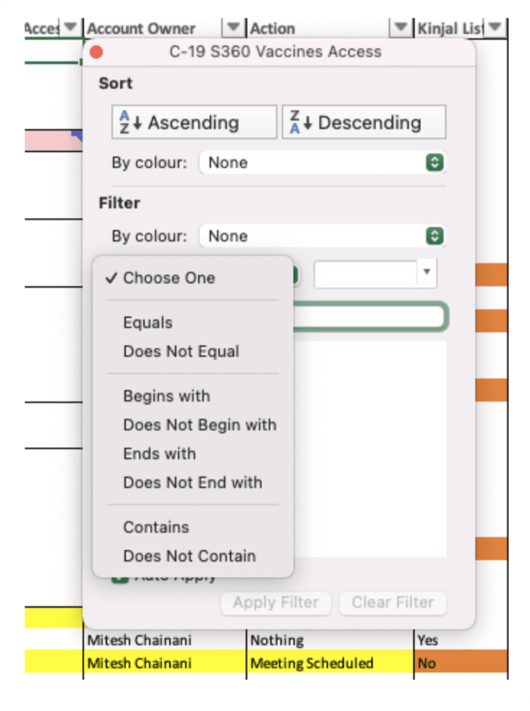
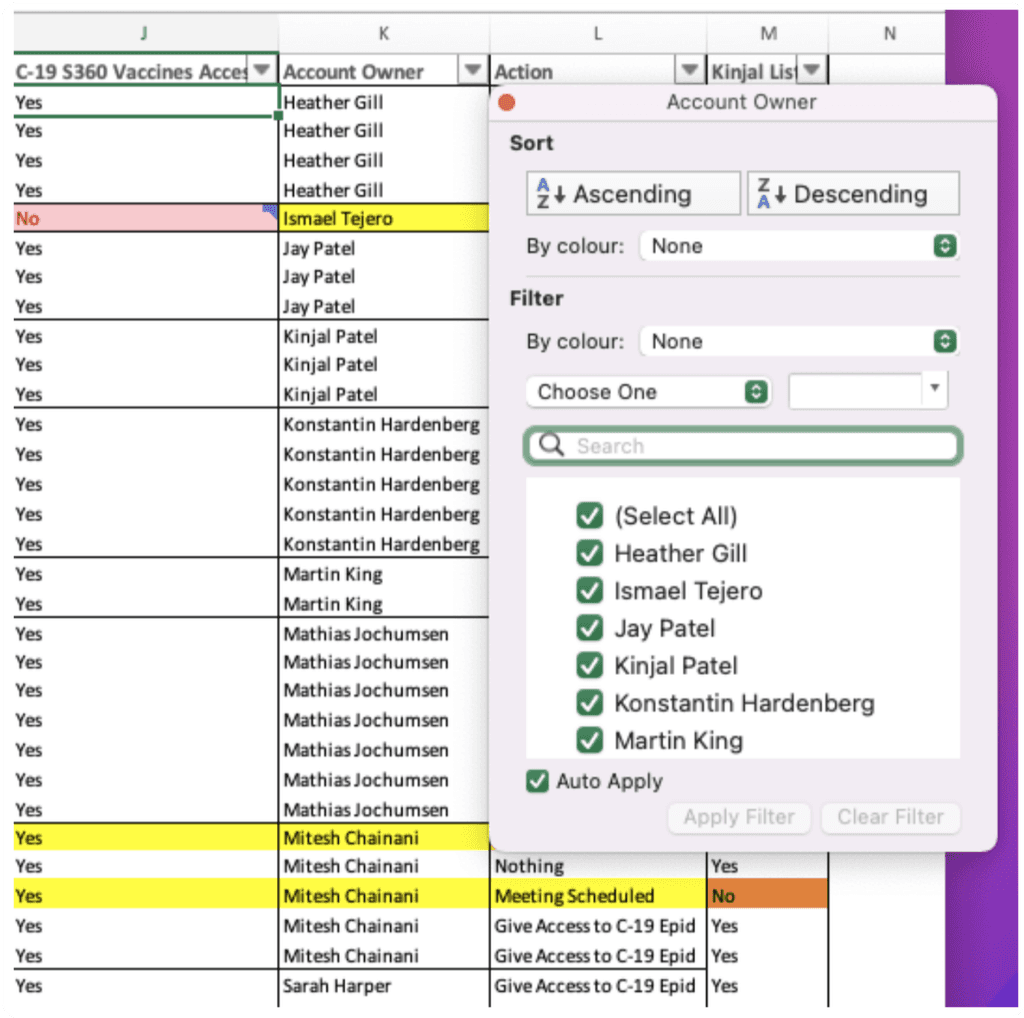
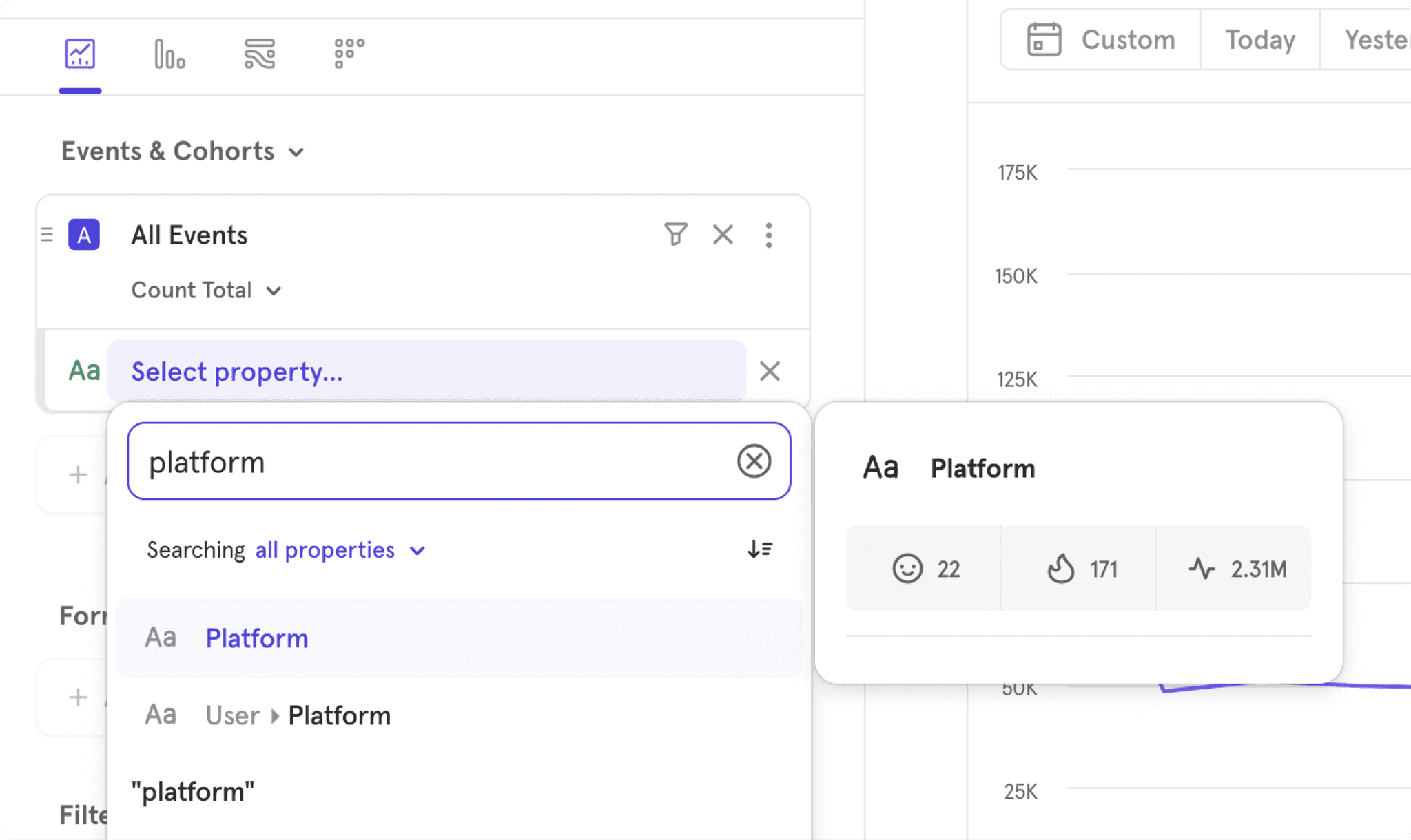
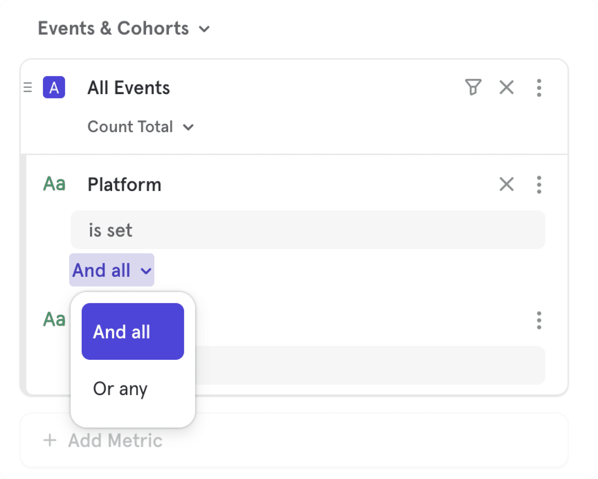
Competitive Research: Analyzed advanced filtering options in platforms like Excel and Mixpanel to pinpoint industry best practices.
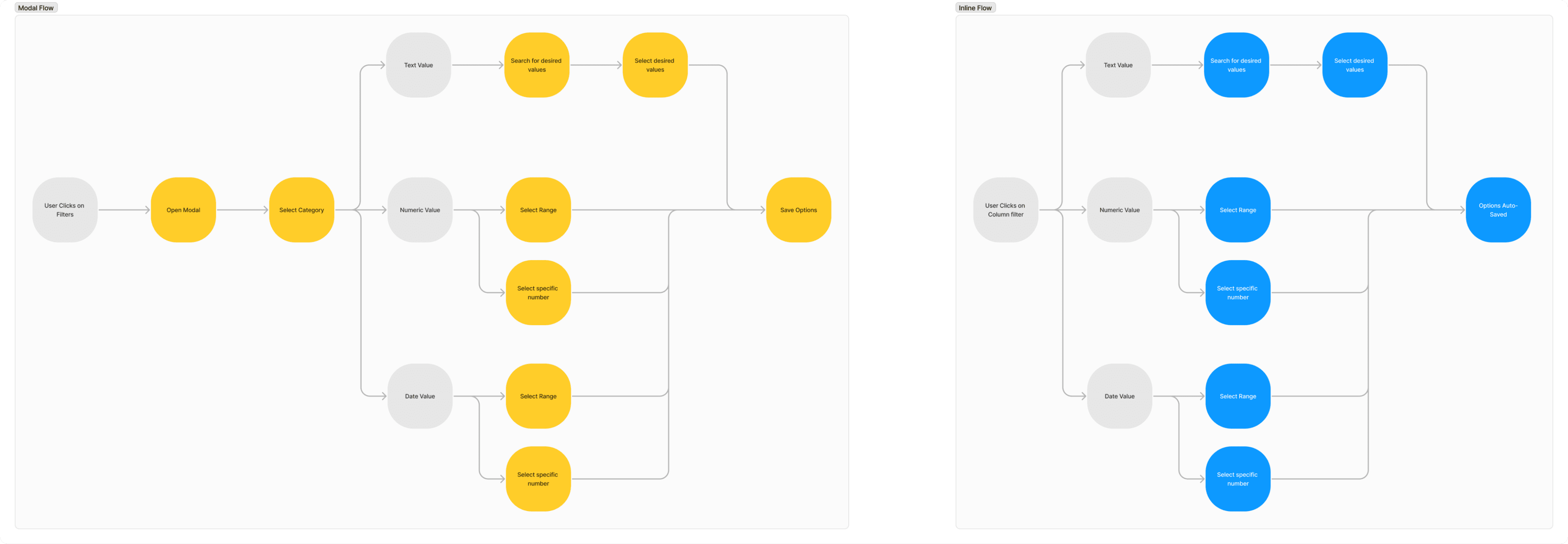
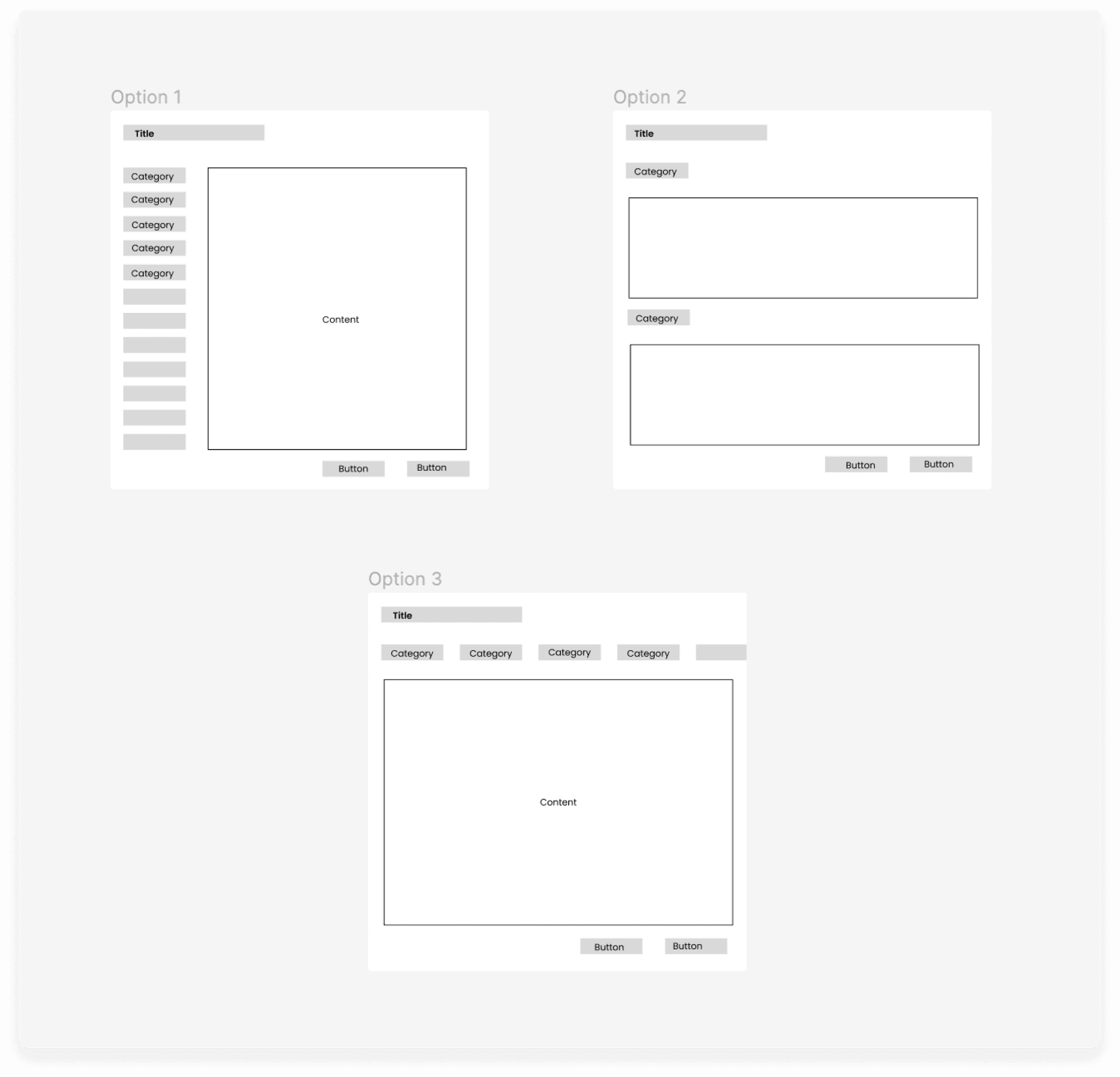
UX/UI Design: Created user flows, wireframes, and high-fidelity prototypes, iterating based on feedback from cross-functional team members and stakeholders.
Team
I collaborated closely with a Lead Product Designer (Zee Durrani), Product Manager (Craig McAuliffe), and engineering team, contributing to both strategic direction and design execution.
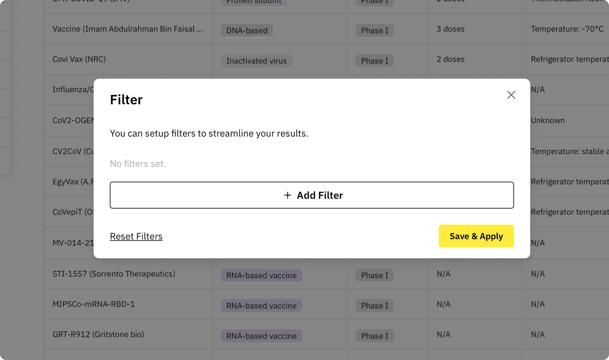
Filters could only be accessed through a high-level button, making it hard to filter by column.
Confusing multi-step processes that caused user drop-offs.
Lack of essential features, such as search options and visible filter selections.
Inline dropdowns were preferred over advanced filters, offering quick access for users.
All platforms included a search feature within filters, making it easier to locate specific values from long lists.
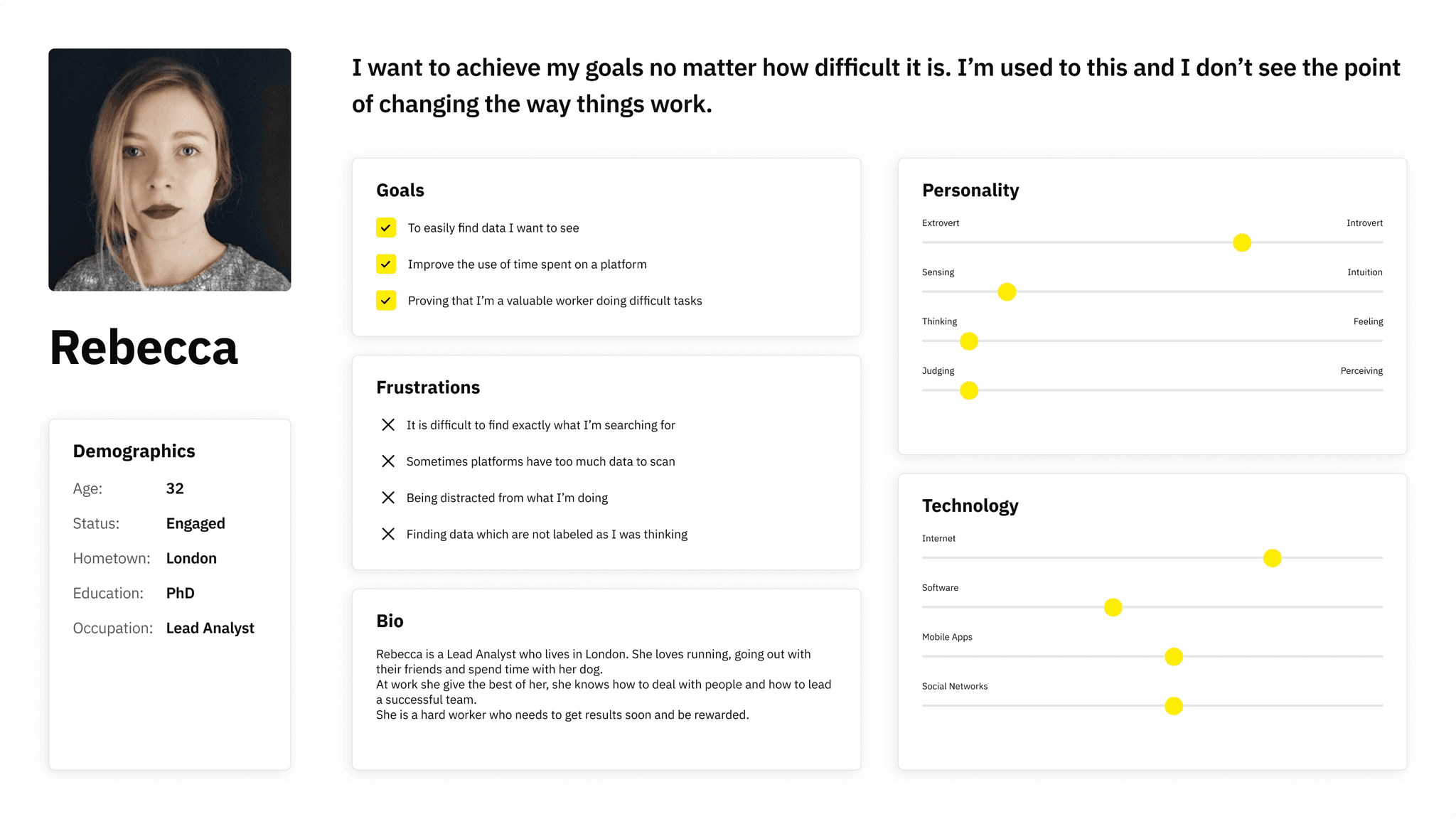
Advanced filtering options were expected by power users, who rely on highly customizable controls for their workflows.
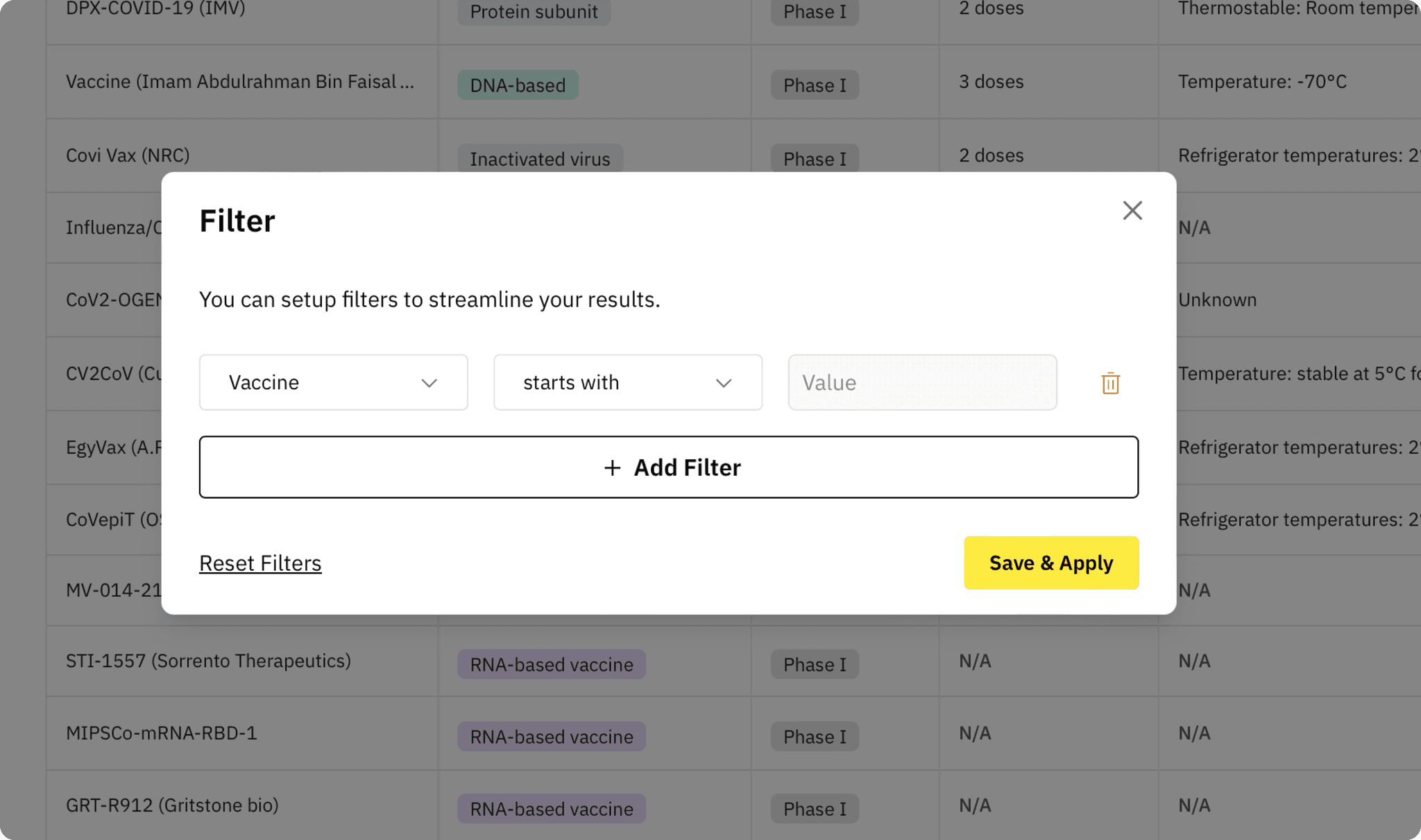
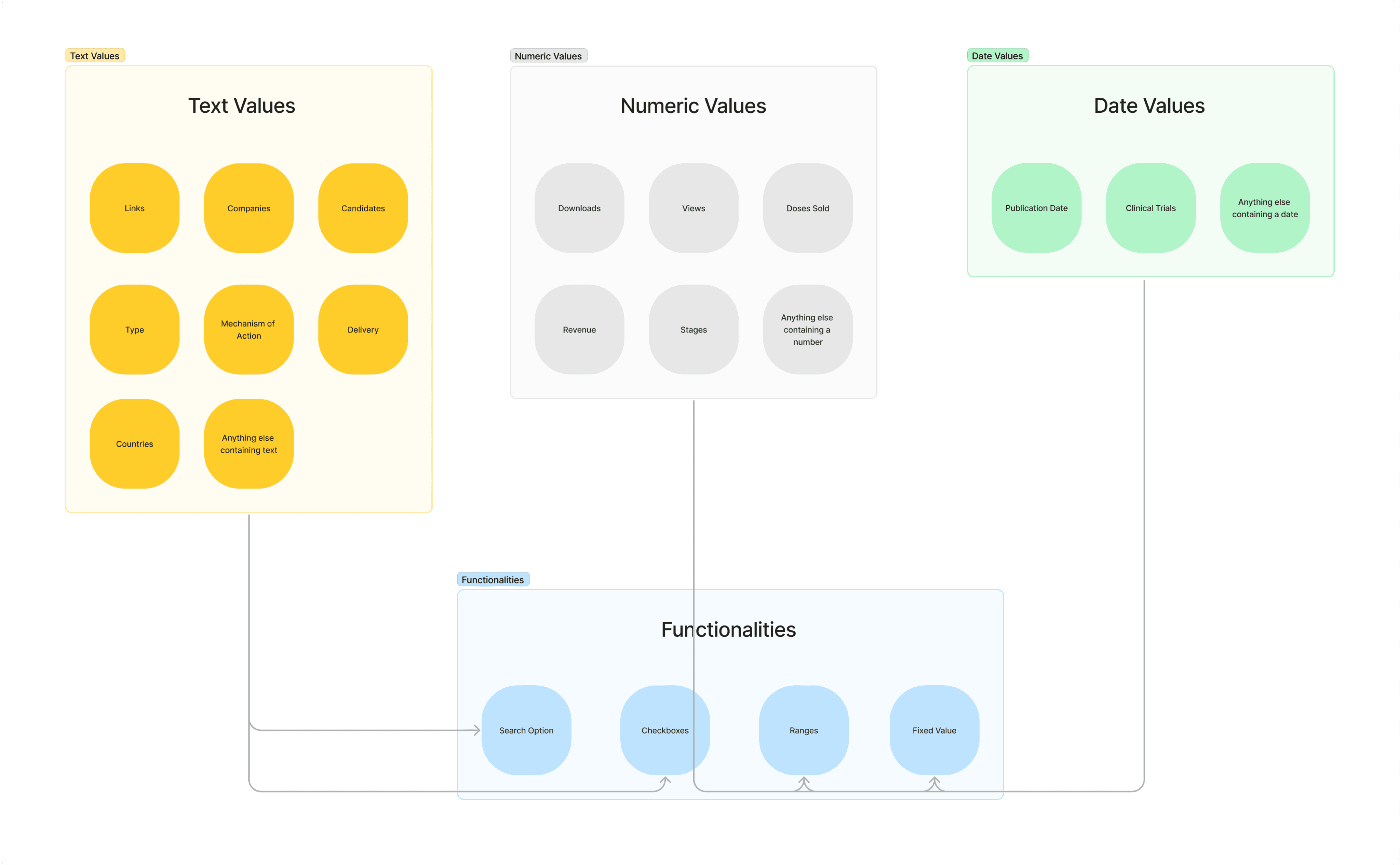
Text values
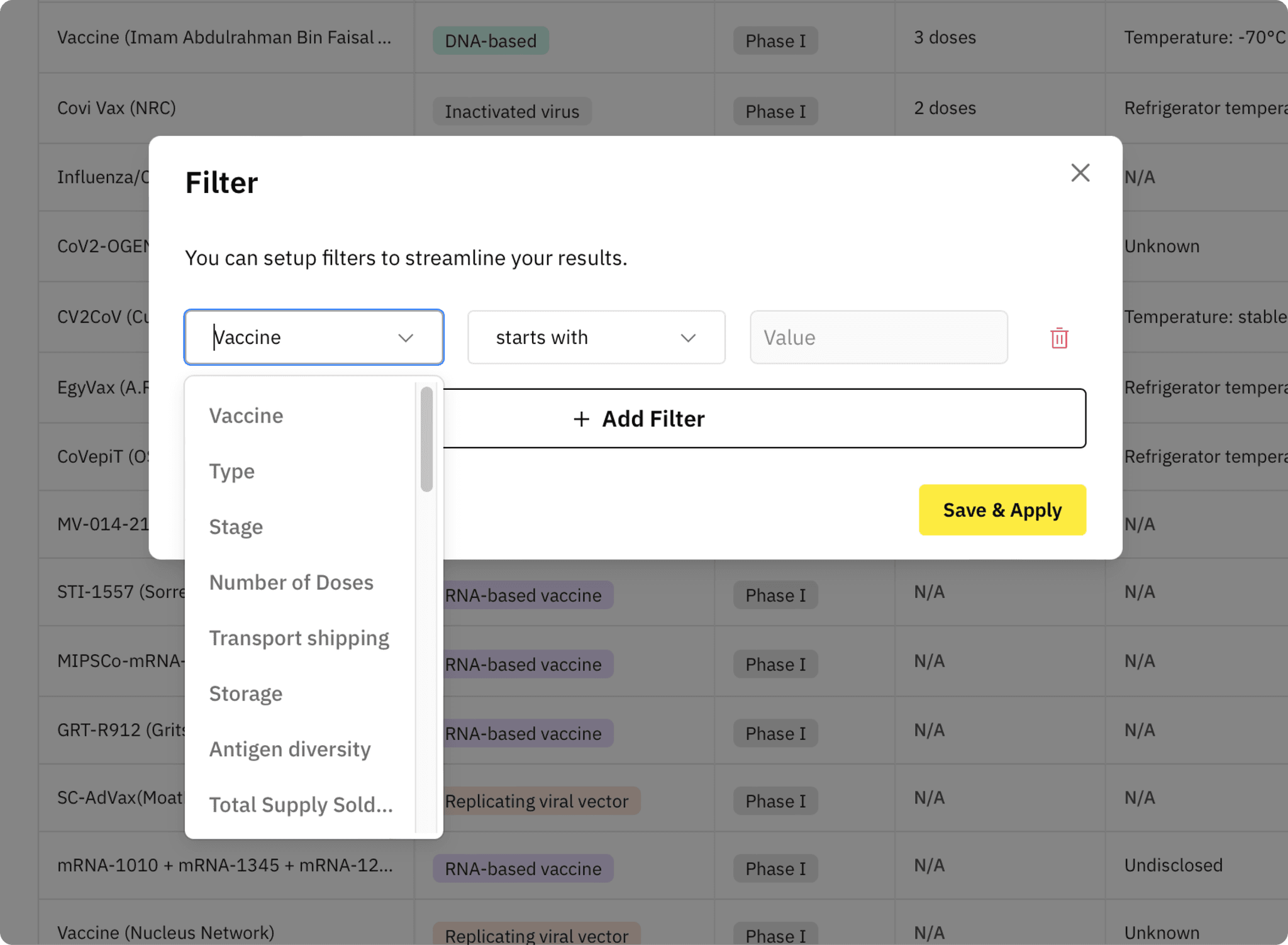
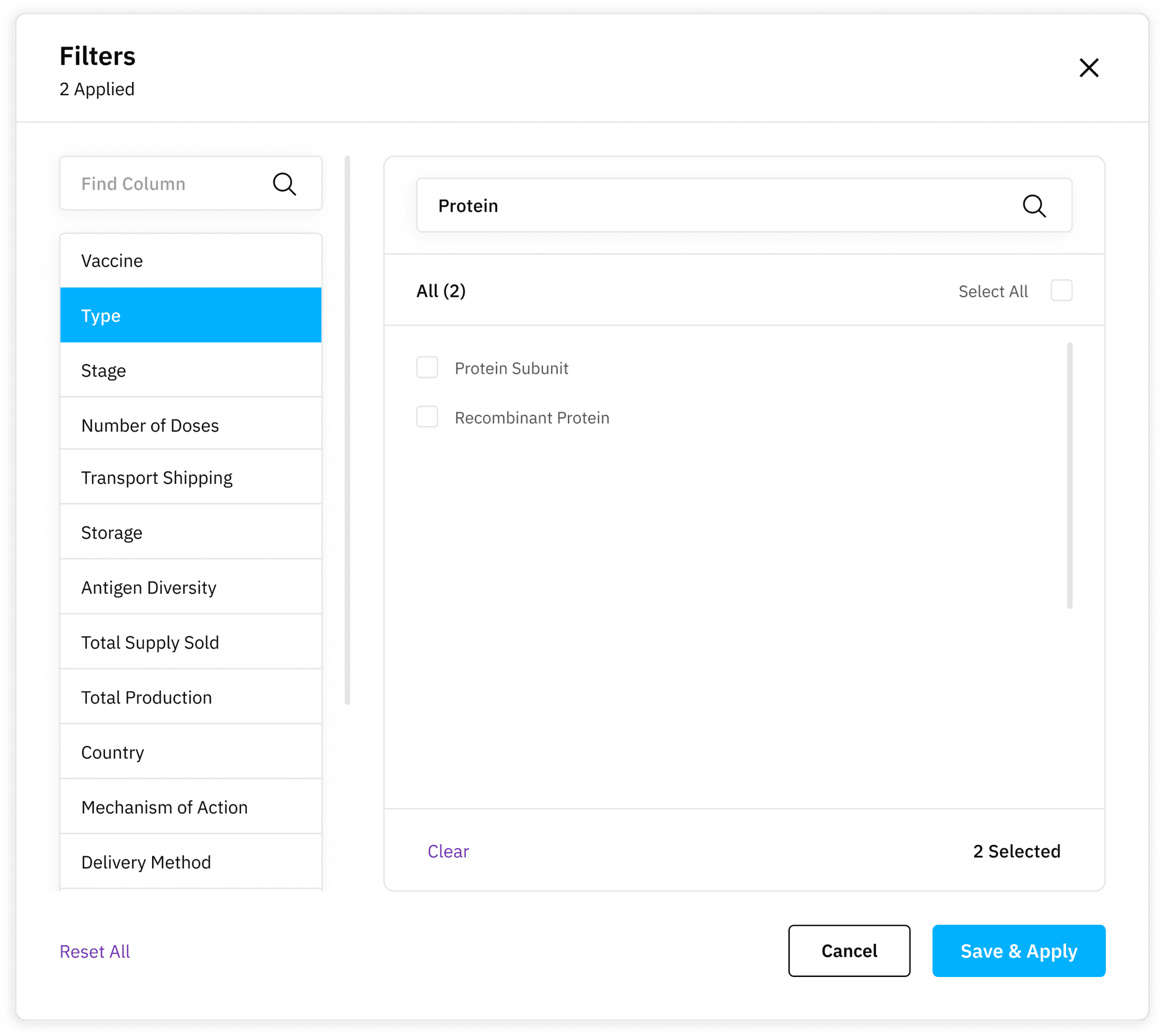
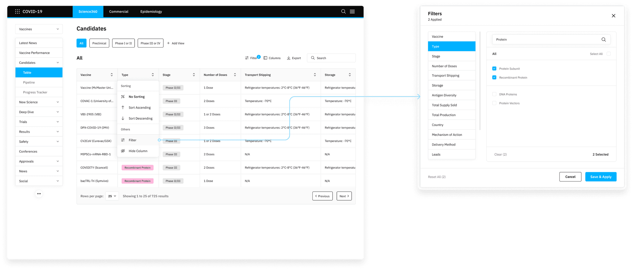
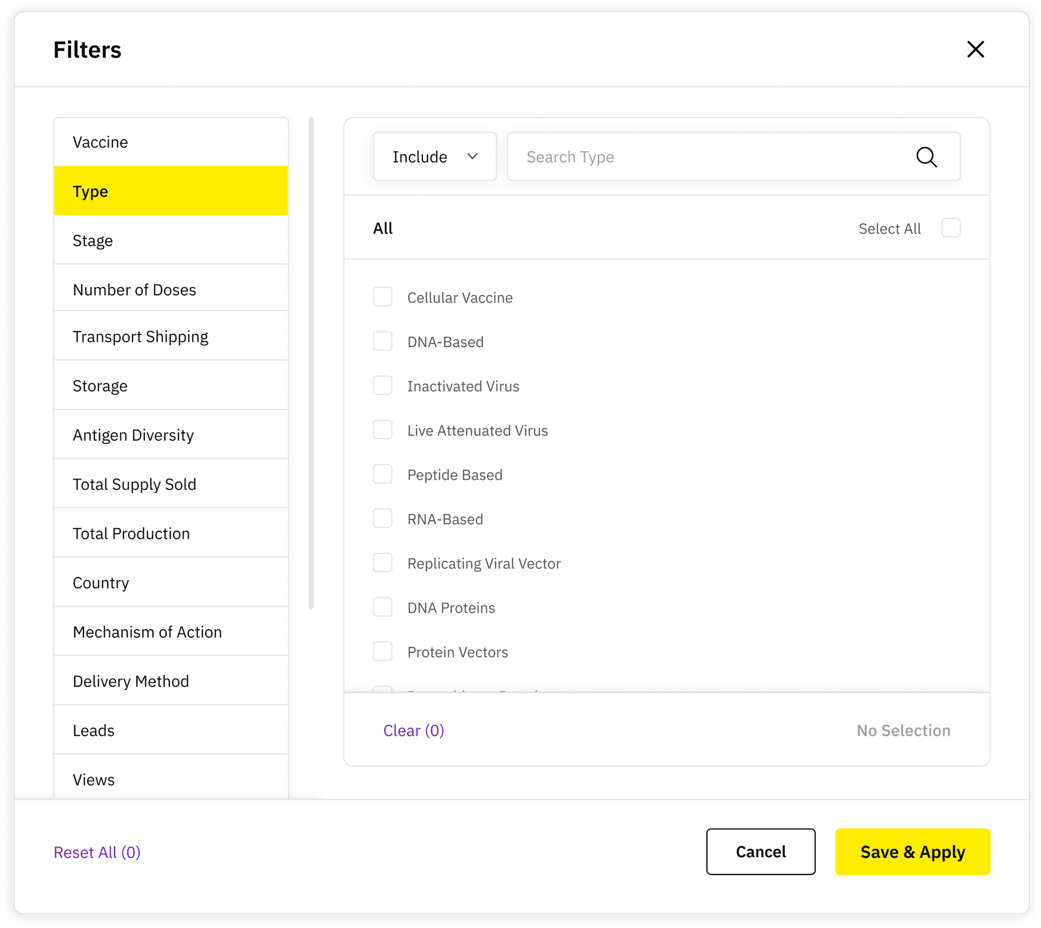
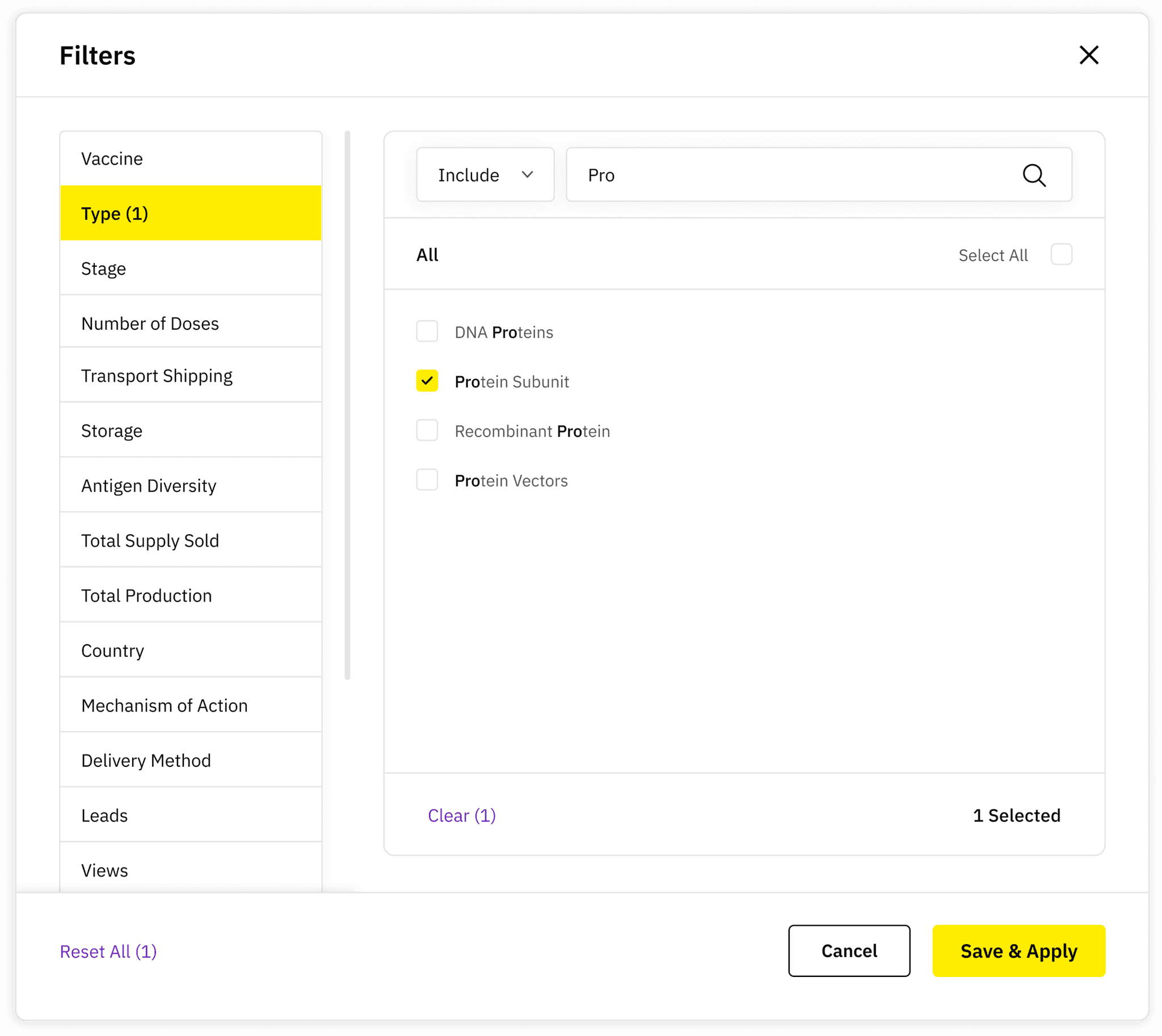
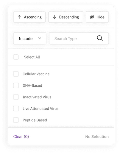
Added checkboxes with a search bar to improve usability.
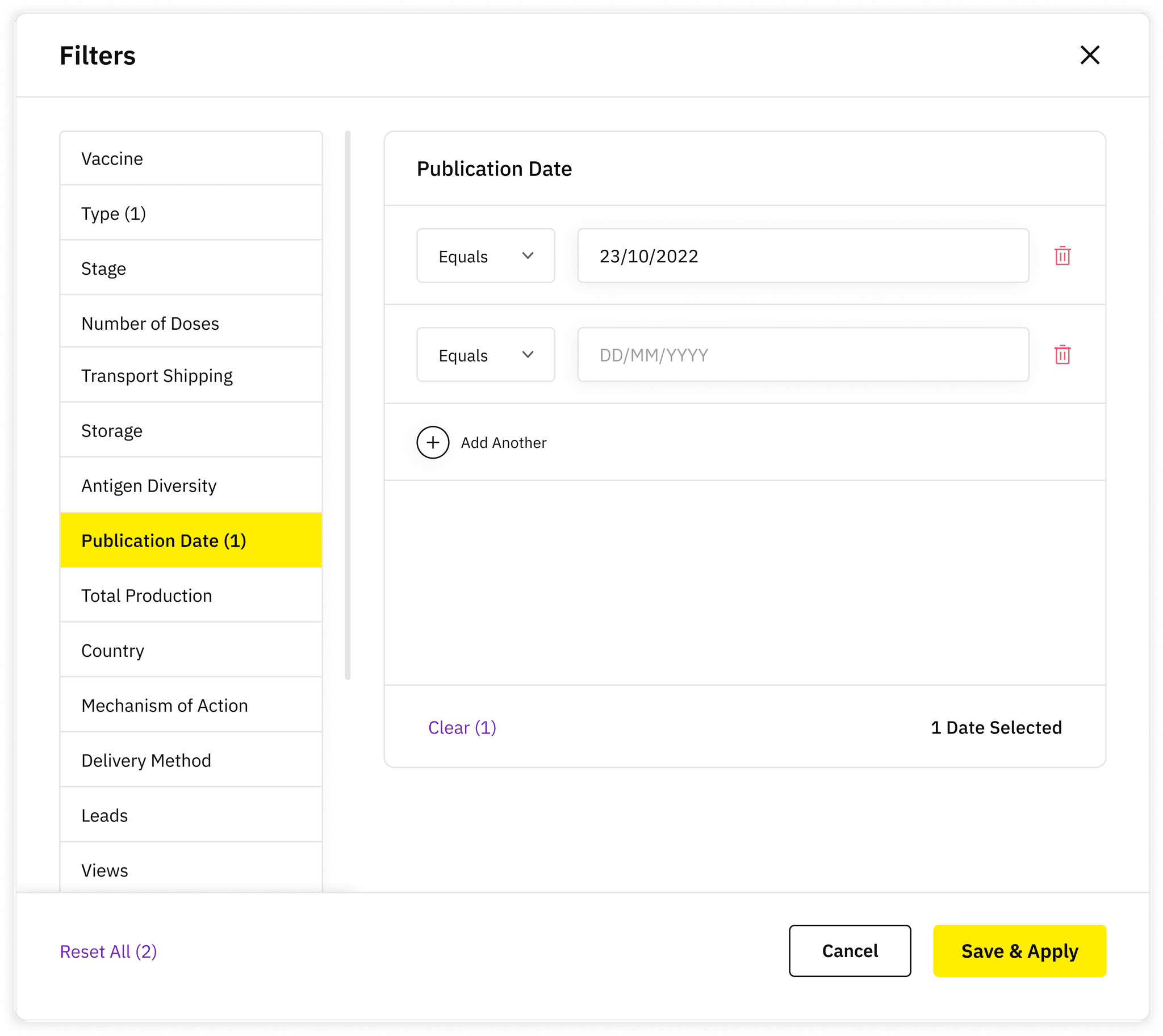
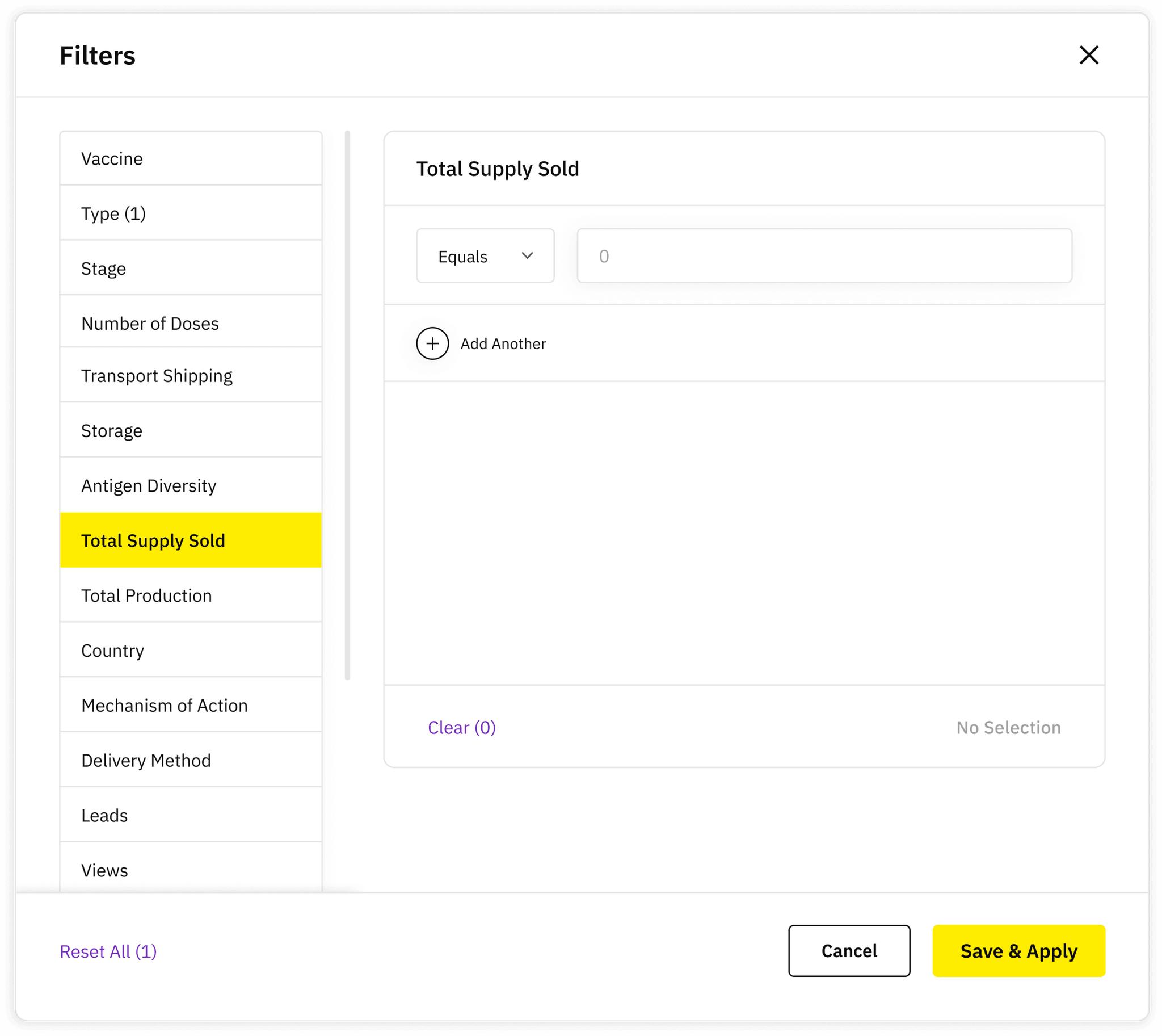
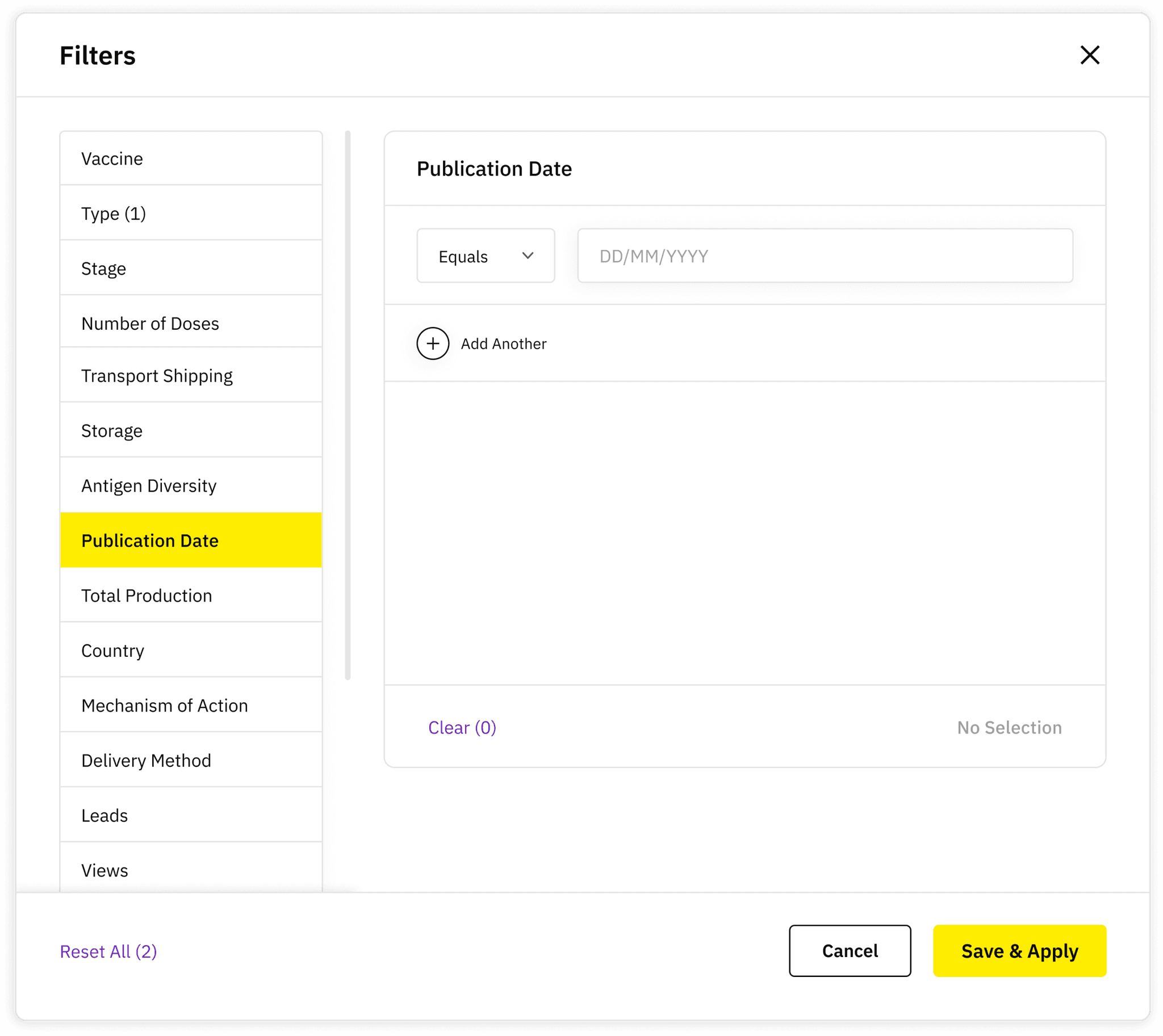
Numerical and dates
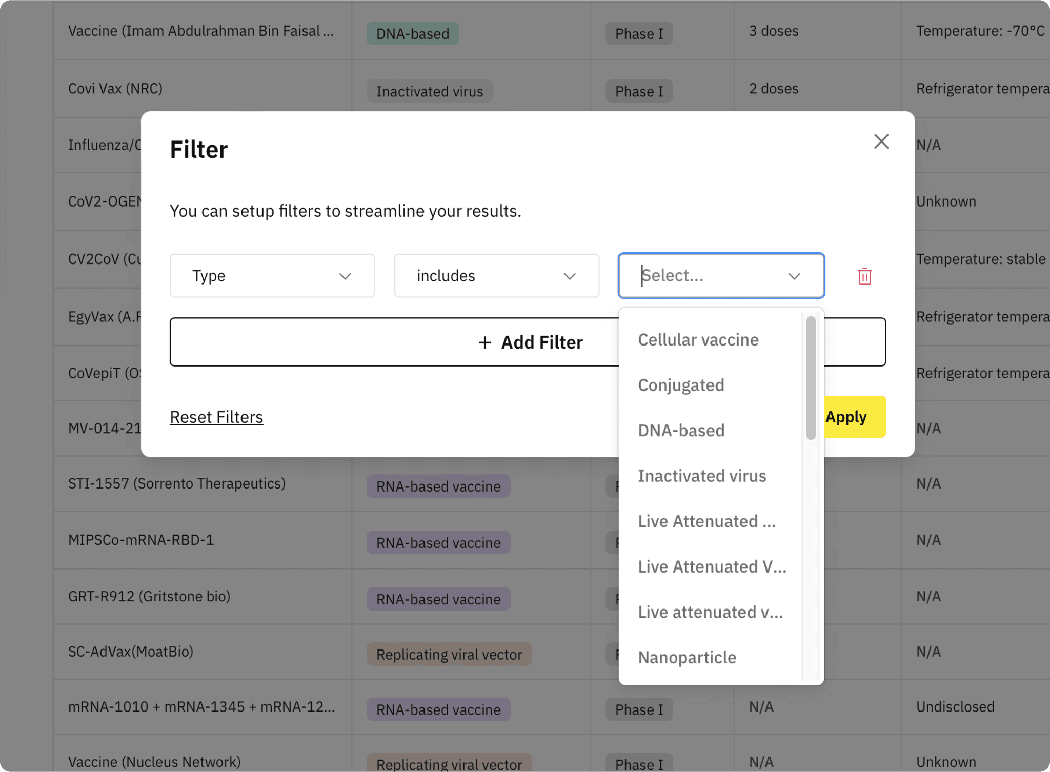
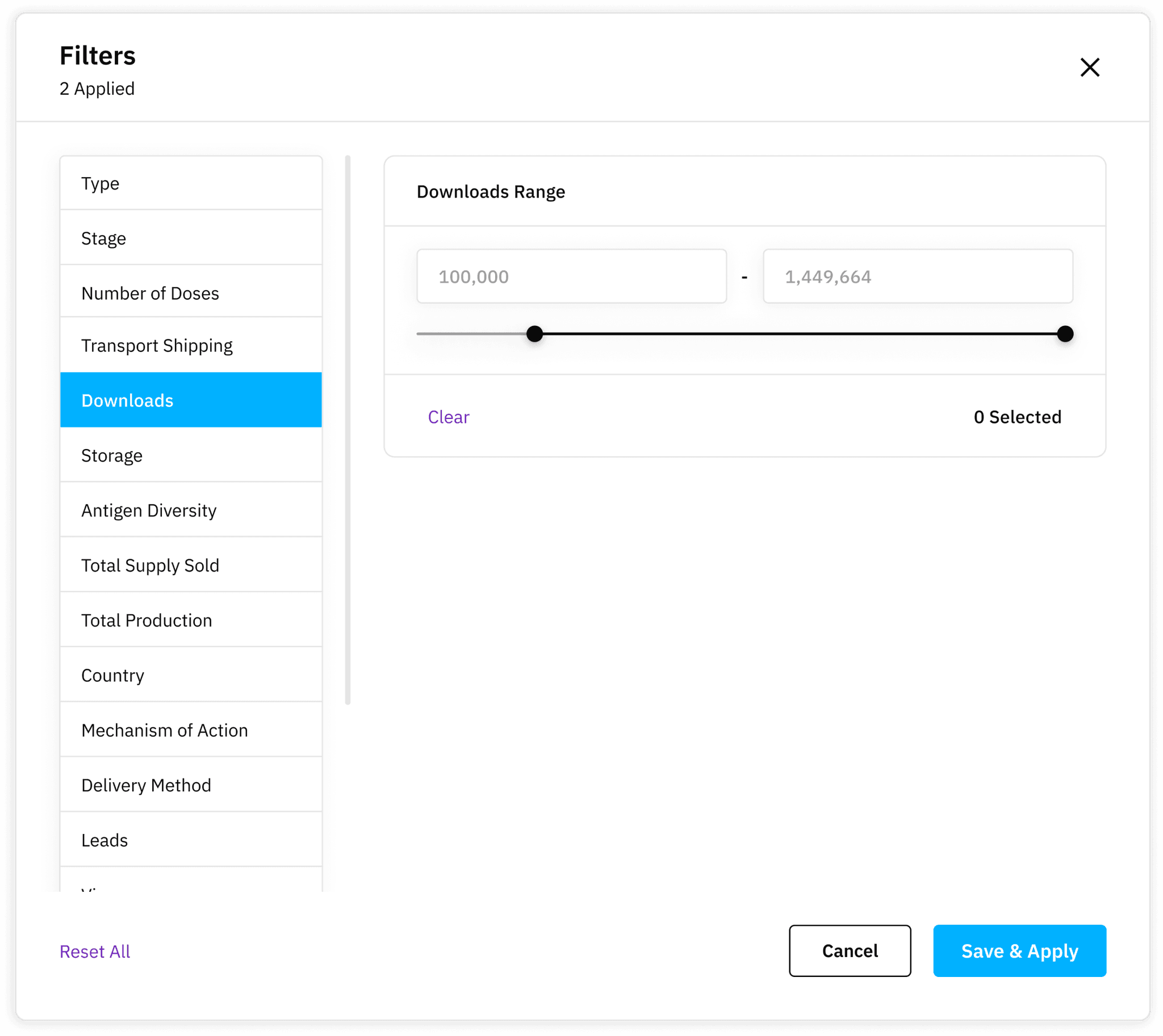
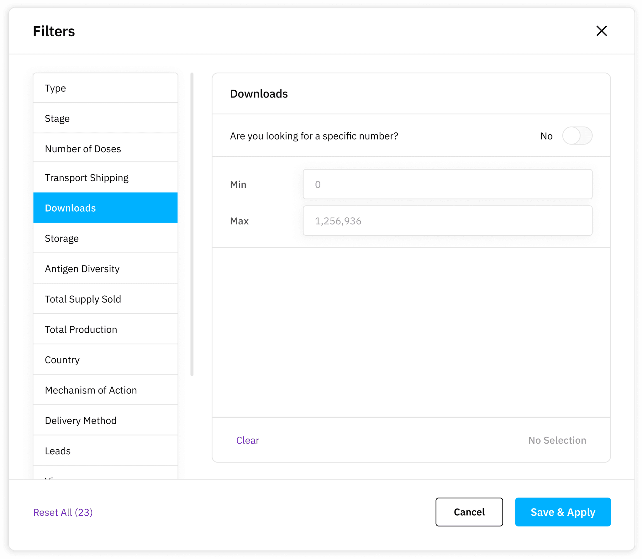
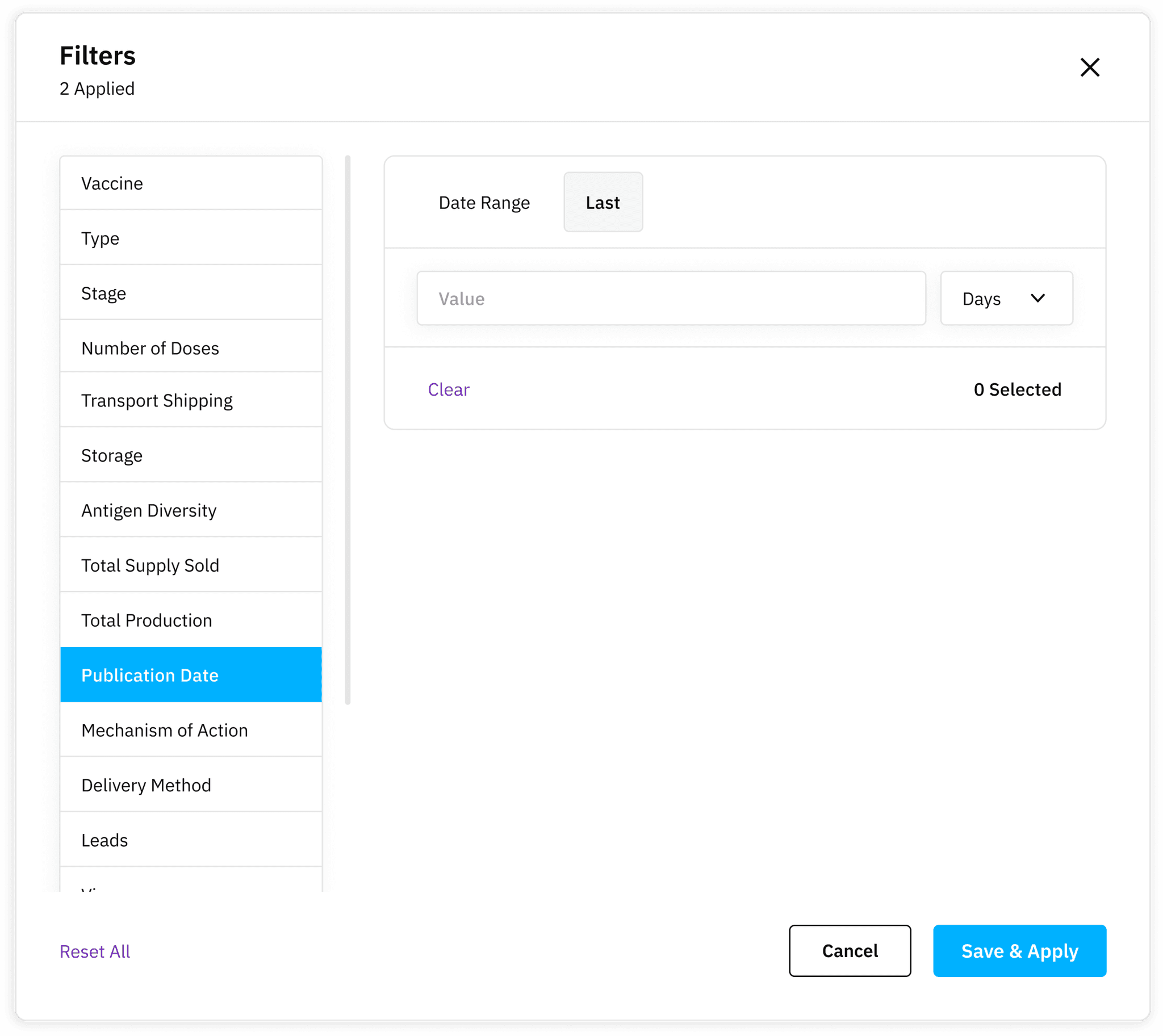
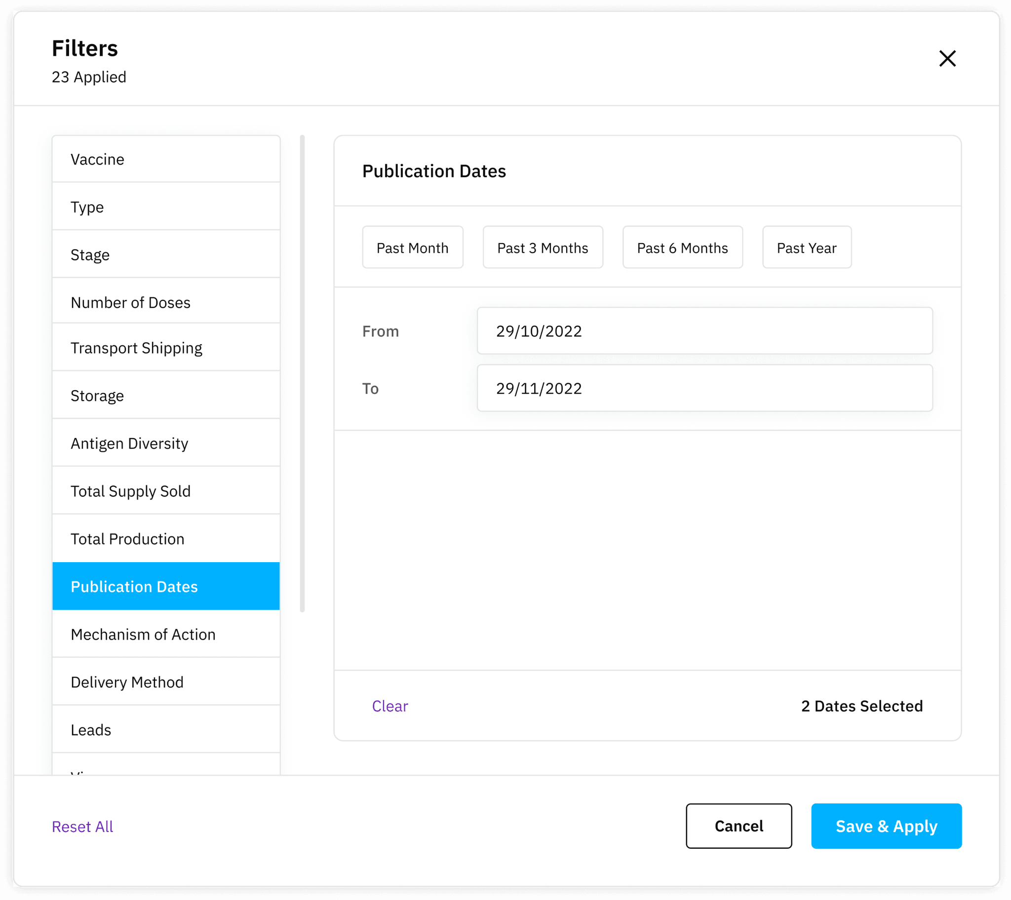
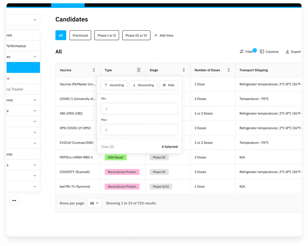
Iterated through several versions, incorporating user feedback to enable single-value selections and ranges while optimizing clarity.
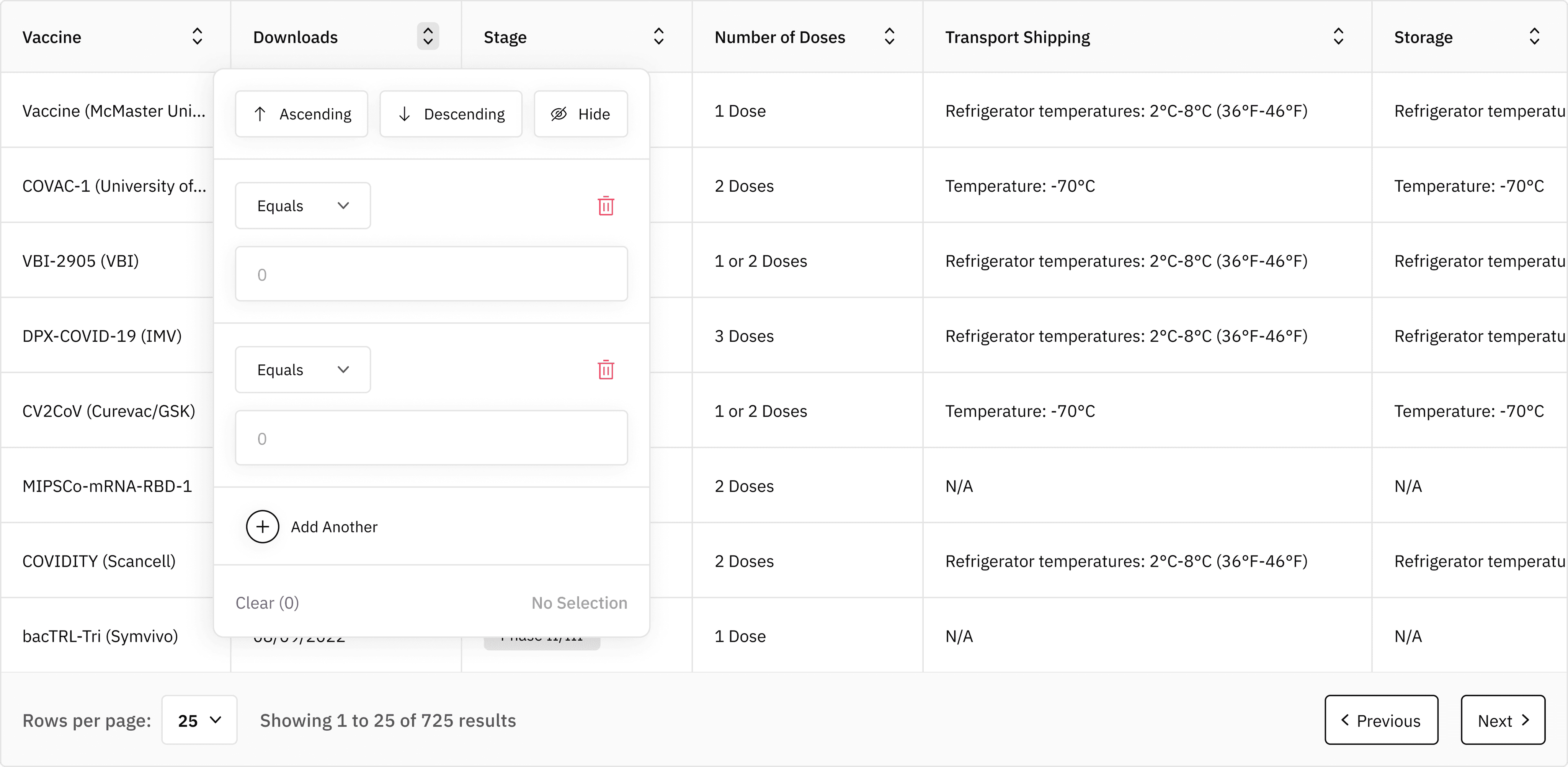
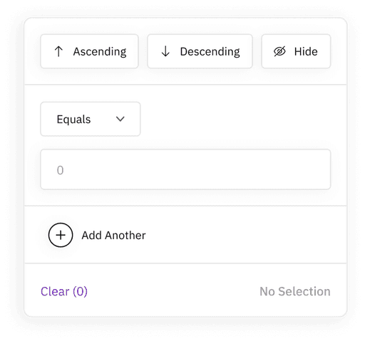
Inline options
Created a dropdown that mirrored modal functionality, providing users quick access to filtering without additional steps.
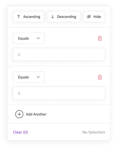
User-Centered approach
Feedback-driven adjustments, like the option to add rows within filter categories, contributed to a more flexible experience, accommodating advanced filtering needs.
Improved modal
Added a “reset all” button and indicators for active filters, improving overall usability.
Enhanced controls
Integrated a search bar and dropdowns for text and numeric filters, significantly improving speed and ease of use.
Impact
Early qualitative feedback showed that users found the redesigned filtering system more intuitive, with a 40% increase in ease of use reported in surveys. Initial data pointed to a 25% rise in filter engagement, as users more frequently applied filters directly within the table view. Early indicators also projected a 30% boost in task completion rates, confirming that the redesign improved both user satisfaction and workflow efficiency.
Key learnings
This project reinforced the importance of distinguishing between B2B and B2C user expectations. While we initially aimed for a consumer-style streamlined approach, feedback highlighted that B2B users valued control and customization over simplicity. This learning helped refine my approach to user-centered design, especially in enterprise products where functional depth is often prioritized over minimal steps.

